Where front components can be used
Front components can render in two locations within Twenty:- Side panel — Non-headless front components open in the right-hand side panel. This is the default behavior when a front component is triggered from the command menu.
- Widgets (dashboards and record pages) — Front components can be embedded as widgets inside page layouts. When configuring a dashboard or a record page layout, users can add a front component widget.
- Pair it with a command menu item — registers it in the command menu (Cmd+K) and, optionally, as a pinned quick-action.
- Embed it as a widget in a page layout — places it on a record’s detail page or dashboard.
Basic example
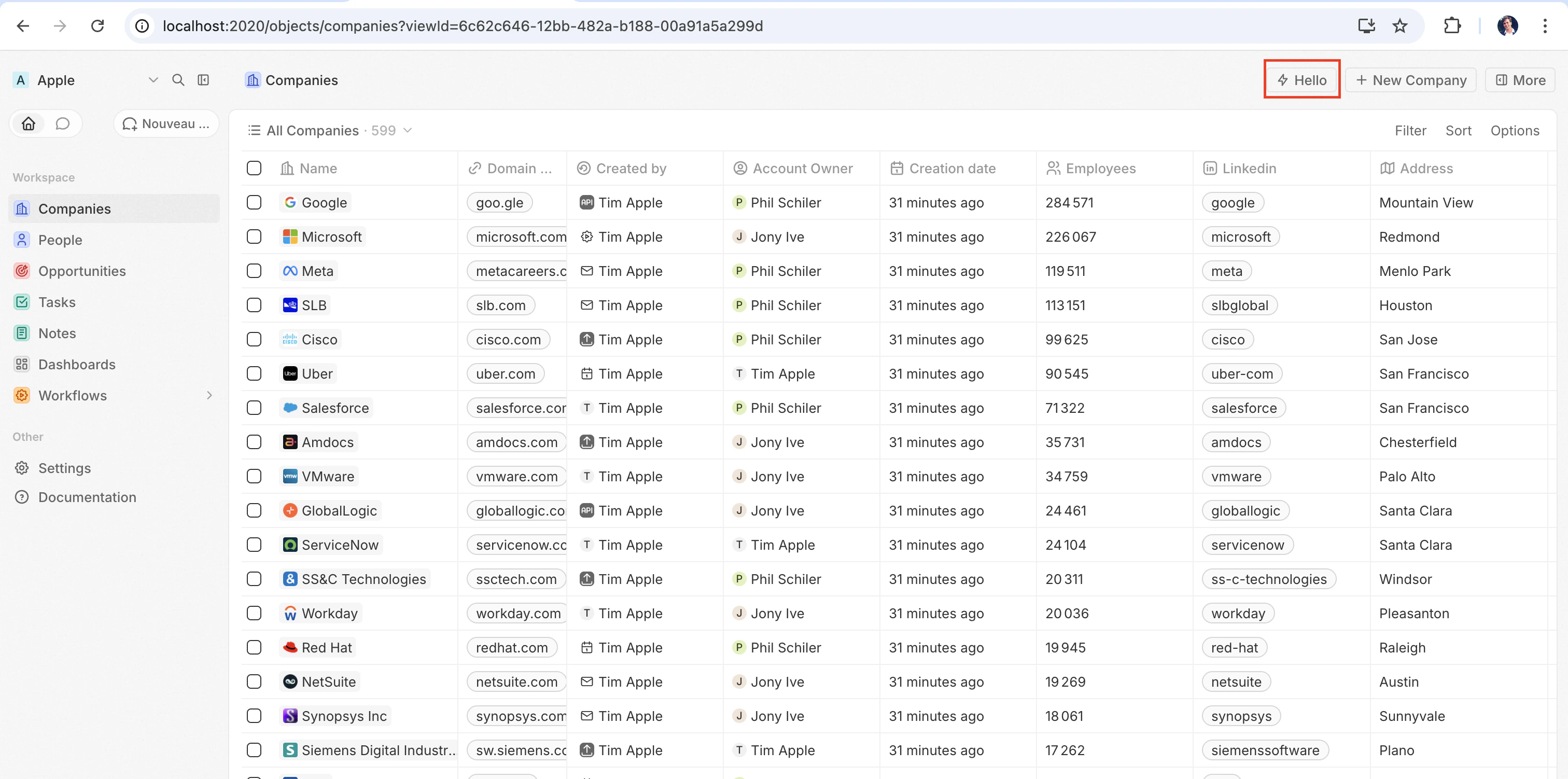
The quickest way to see a front component in action is to pair it with adefineCommandMenuItem, so it appears as a quick-action button in the top-right corner of the page:
src/front-components/hello-world.tsx
src/command-menu-items/hello-world.command-menu-item.ts
yarn twenty dev (or running a one-shot yarn twenty dev --once), the quick action appears in the top-right corner of the page:
Configuration fields
| Field | Required | Description |
|---|---|---|
universalIdentifier | Yes | Stable unique ID for this component |
component | Yes | A React component function |
name | No | Display name |
description | No | Description of what the component does |
isHeadless | No | Set to true if the component has no visible UI (see below) |
Placing a front component on a page
Beyond commands, you can embed a front component directly into a record page by adding it as a widget in a page layout. See Page Layouts for details.Headless vs non-headless
Front components come in two rendering modes controlled by theisHeadless option:
Non-headless (default) — The component renders a visible UI. When triggered from the command menu it opens in the side panel. This is the default behavior when isHeadless is false or omitted.
Headless (isHeadless: true) — The component mounts invisibly in the background. It does not open the side panel. Headless components are designed for actions that execute logic and then unmount themselves — for example, running an async task, navigating to a page, or showing a confirmation modal. They pair naturally with the SDK Command components described below.
src/front-components/sync-tracker.tsx
null, Twenty skips rendering a container for it — no empty space appears in the layout. The component still has access to all hooks and the host communication API.
SDK Command components
Thetwenty-sdk package provides four Command helper components designed for headless front components. Each component executes an action on mount, handles errors by showing a snackbar notification, and automatically unmounts the front component when done.
Import them from twenty-sdk/command:
Command— Runs an async callback via theexecuteprop.CommandLink— Navigates to an app path. Props:to,params,queryParams,options.CommandModal— Opens a confirmation modal. If the user confirms, executes theexecutecallback. Props:title,subtitle,execute,confirmButtonText,confirmButtonAccent.CommandOpenSidePanelPage— Opens a specific side panel page. Props:page,pageTitle,pageIcon.
Command to run an action from the command menu:
src/front-components/run-action.tsx
src/command-menu-items/run-action.command-menu-item.ts
CommandModal to ask for confirmation before executing:
src/front-components/delete-draft.tsx
Calling a logic function
Front components run browser-side in a sandboxed Web Worker, while logic functions run server-side. There is no direct in-process call between the two — instead, a front component reaches a logic function over HTTP. A logic function declared withhttpRouteTriggerSettings is exposed under the /s/ endpoint at ${TWENTY_API_URL}/s<path>. Your front component calls that route with the RestApiClient from twenty-client-sdk/rest, which authenticates with the TWENTY_APP_ACCESS_TOKEN that Twenty injects into the worker.
The RestApiClient is built for exactly this. It reads TWENTY_API_URL and TWENTY_APP_ACCESS_TOKEN from the worker environment, attaches the Authorization: Bearer header, serializes and parses JSON, and throws a RestApiClientError when the token or URL is missing or the response is non-2xx — so you don’t reimplement that boilerplate in every component.
A headless front component can run the call on mount via the Command component, then unmount automatically:
src/front-components/sync-prs.tsx
httpRouteTriggerSettings.path prefixed with /s. Keep isAuthRequired: true; the client supplies the app access token Twenty mints for your component:
src/logic-functions/fetch-prs.logic-function.ts
TWENTY_API_URL and TWENTY_APP_ACCESS_TOKEN are injected automatically — see Application variables. Because secret application variables are never exposed to front components, keep API keys and other sensitive logic in the logic function, not in the front component.RestApiClient reference
ImportRestApiClient from twenty-client-sdk/rest. It belongs to the same client family as CoreApiClient and MetadataApiClient, but targets your app’s HTTP routes instead of the GraphQL API.
| Method | Description |
|---|---|
get(path, options?) | Sends a GET request |
post(path, body?, options?) | Sends a POST request |
put(path, body?, options?) | Sends a PUT request |
patch(path, body?, options?) | Sends a PATCH request |
delete(path, options?) | Sends a DELETE request |
request(method, path, options?) | Generic request with any HTTP method |
options accepts headers, query (a record of query-string params; nullish values are skipped), and an AbortSignal via signal. A non-FormData object body is JSON-serialized automatically. On a 401, the client refreshes the access token once through the host and retries the request.
The base URL and token are resolved from the environment by default. Pass overrides to the constructor when needed — for example in tests:
RestApiClientError exposing status, statusText, url, and the parsed body:
Accessing runtime context
Inside your component, use SDK hooks to access the current user, record, and component instance:src/front-components/record-info.tsx
| Hook | Returns | Description |
|---|---|---|
useUserId() | string or null | The current user’s ID |
useSelectedRecordIds() | string[] | All selected record IDs (empty array if none selected) |
useRecordId() | string or null | Deprecated. Use useSelectedRecordIds() instead |
useFrontComponentId() | string | This component instance’s ID |
useColorScheme() | 'light' or 'dark' | The host UI’s active color scheme (System is already resolved) |
useFrontComponentExecutionContext(selector) | varies | Access the full execution context with a selector function |
Application variables
Application variables defined indefineApplication() with isSecret: false are available inside front components via the getApplicationVariable utility:
src/front-components/greeting.tsx
process.env:
| Variable | Description |
|---|---|
TWENTY_API_URL | Base URL of the Twenty API |
TWENTY_APP_ACCESS_TOKEN | Short-lived token scoped to your app’s role |
Host communication API
Front components can trigger navigation, modals, and notifications using functions fromtwenty-sdk:
| Function | Description |
|---|---|
navigate(to, params?, queryParams?, options?) | Navigate to a page in the app |
openSidePanelPage(params) | Open a side panel |
closeSidePanel() | Close the side panel |
openCommandConfirmationModal(params) | Show a confirmation dialog |
enqueueSnackbar(params) | Show a toast notification |
unmountFrontComponent() | Unmount the component |
updateProgress(progress) | Update a progress indicator |
src/front-components/archive-record.tsx
Working with multiple records
UseuseSelectedRecordIds() to handle multiple selected records. This is useful for bulk operations:
src/front-components/bulk-export.tsx
Public assets
Front components can access files from the app’spublic/ directory using getPublicAssetUrl:
Styling
Front components support multiple styling approaches. You can use:- Inline styles —
style={{ color: 'red' }} - Twenty UI components — import from
twenty-sdk/ui(Button, Tag, Status, Chip, Avatar, and more) - Emotion — CSS-in-JS with
@emotion/react - Styled-components —
styled.divpatterns - Tailwind CSS — utility classes
- Any CSS-in-JS library compatible with React