Widgets disponibles
Twenty propose différents types de widgets pour visualiser vos données CRM.Diagrammes en barres
Affichez les données sous forme de barres horizontales ou verticales.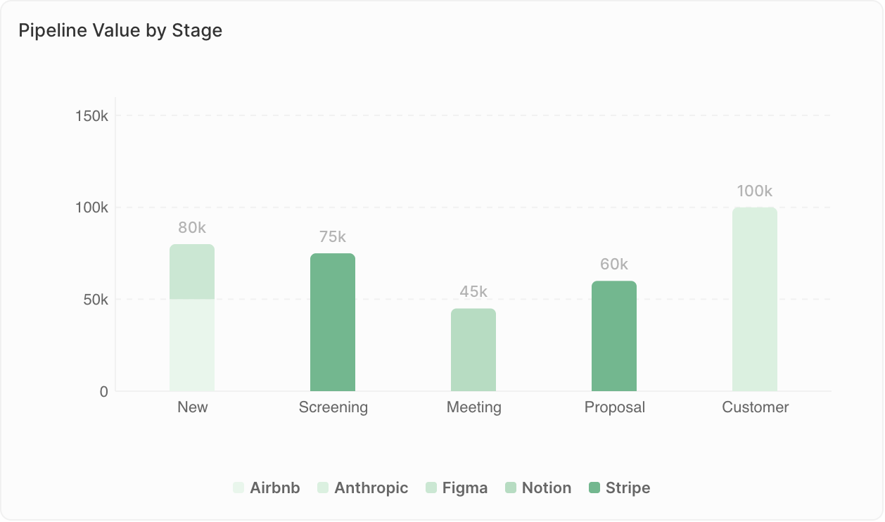
- Comparer des valeurs entre catégories
- Afficher des classements
- Suivre des indicateurs par période
- Opportunités par étape
- Revenus par commercial
- Contacts ajoutés par mois
Limites d’affichage : Les diagrammes en barres peuvent afficher au maximum 100 barres, et 50 groupes par barre lors de l’utilisation de Group By. Si vous voyez l’avertissement “Données non affichées : X barres max par graphique”, ajoutez des filtres pour restreindre vos données ou modifiez le regroupement (par ex., regroupez par semaine plutôt que par jours).
Diagrammes en secteurs
Affichez les proportions d’un ensemble.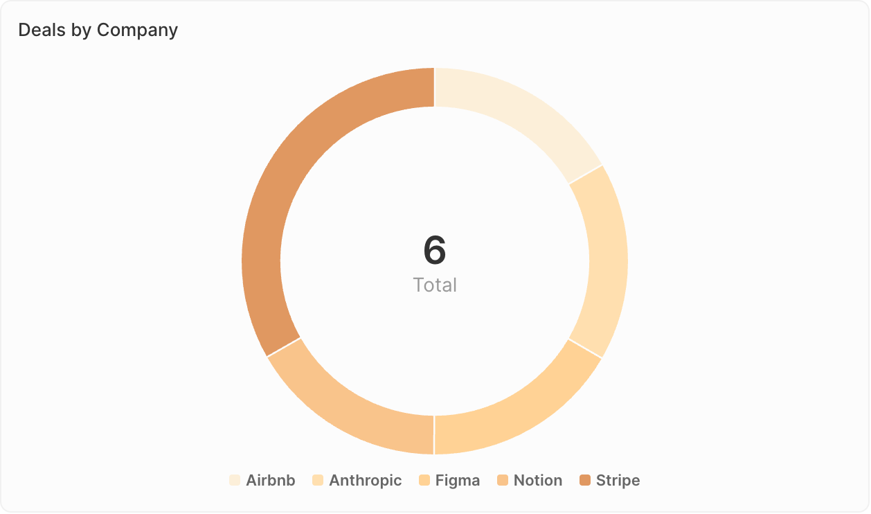
- Afficher la composition ou la répartition
- Comparer les parties au tout
- Mettre en évidence les principaux segments
- Répartition des opportunités par source
- Répartition des contacts par secteur
- Composition du pipeline par propriétaire
Graphiques linéaires
Affichez les tendances au fil du temps.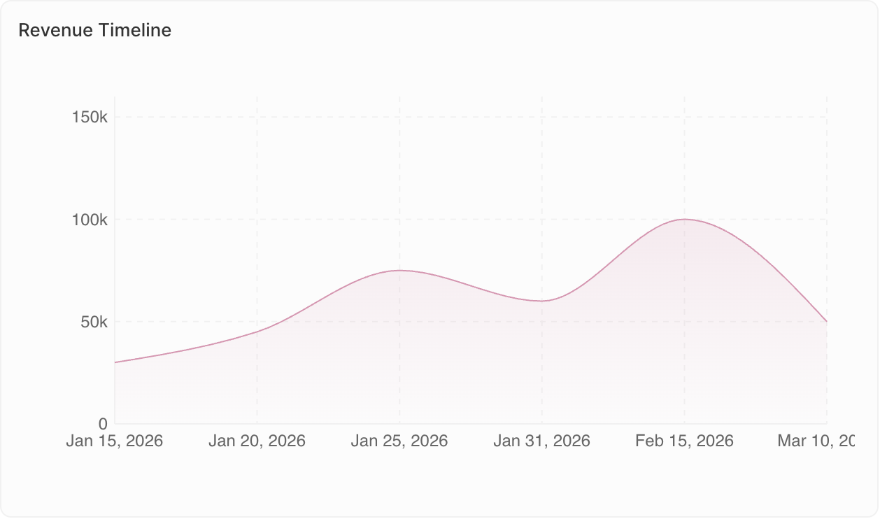
- Suivre les évolutions au fil du temps
- Identifier les tendances
- Comparer plusieurs indicateurs
- Tendance du nombre d’opportunités par mois
- Croissance des revenus par trimestre
- Niveaux d’activité au fil du temps
Graphiques agrégés
Affichez clairement des valeurs clés uniques.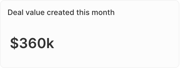
- Mettre en évidence des indicateurs clés de performance (KPI)
- Afficher des totaux ou des moyennes
- Vérifications rapides de l’état
- Valeur totale du pipeline
- Nombre d’opportunités ouvertes
- Taux de conversion
- Ratio : Pour les champs de type Sélection, calculez des ratios entre les valeurs. Accédez à Données affichées → sélectionnez votre champ → activez l’option Ratio.
- Préfixe et suffixe : Ajoutez du texte personnalisé avant ou après le nombre (par ex., préfixe ”$” ou suffixe ”%”) pour une meilleure lisibilité.
iFrames
Intégrez des outils et du contenu externes directement dans votre tableau de bord.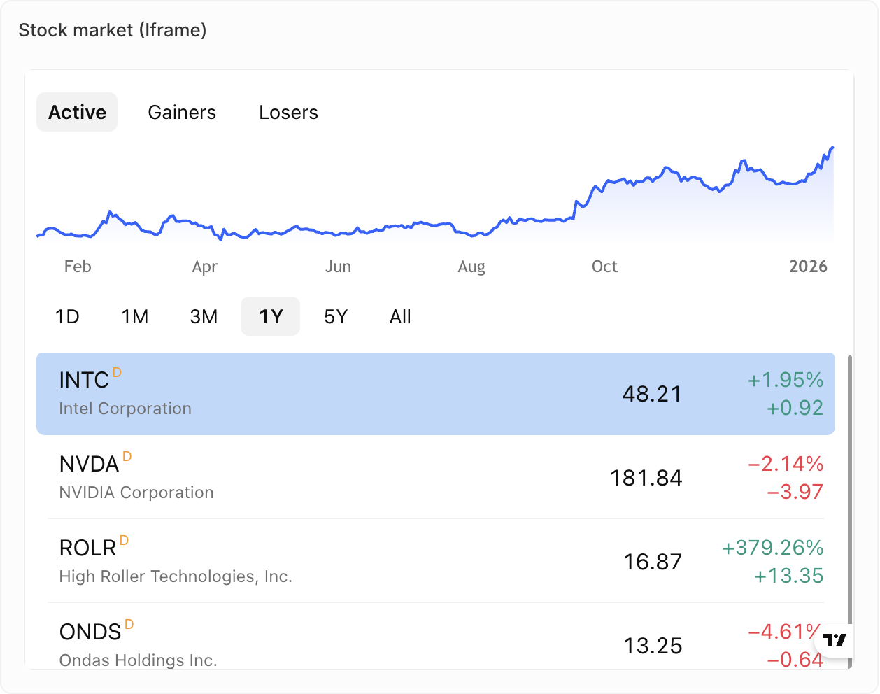
- Afficher des rapports ou tableaux de bord externes
- Intégrer des outils de vente tiers
- Afficher du contenu en direct provenant d’autres systèmes
- Indicateurs de votre outil d’assistance
- Indicateurs de votre composeur d’appels
- Contenu en direct de votre outil de séquences de vente
Texte enrichi
Ajoutez du texte et du contenu mis en forme directement dans votre tableau de bord.
- Ajout de contexte ou d’instructions
- Descriptions du tableau de bord
- Notes et annotations
- Mise en forme de texte enrichi (gras, italique, listes, etc.)
- Importation d’images et de fichiers
- Édition de type Markdown
Bientôt disponible : Les jauges et les tableaux ne sont pas encore disponibles, mais figurent sur notre feuille de route.
Duplication de widgets
- Cliquez sur le widget
- Ouvrez Options
- Cliquez sur Dupliquer le widget