前端组件可用位置
在 Twenty 中,前端组件可在两个位置进行渲染:- 侧边栏 — 非无头的前端组件会在右侧侧边栏中打开。 当前端组件从命令菜单触发时,这是默认行为。
- 小部件(仪表盘和记录页面) — 前端组件可以作为小部件嵌入到页面布局中。 在配置仪表盘或记录页面布局时,用户可以添加前端组件小部件。
基础示例
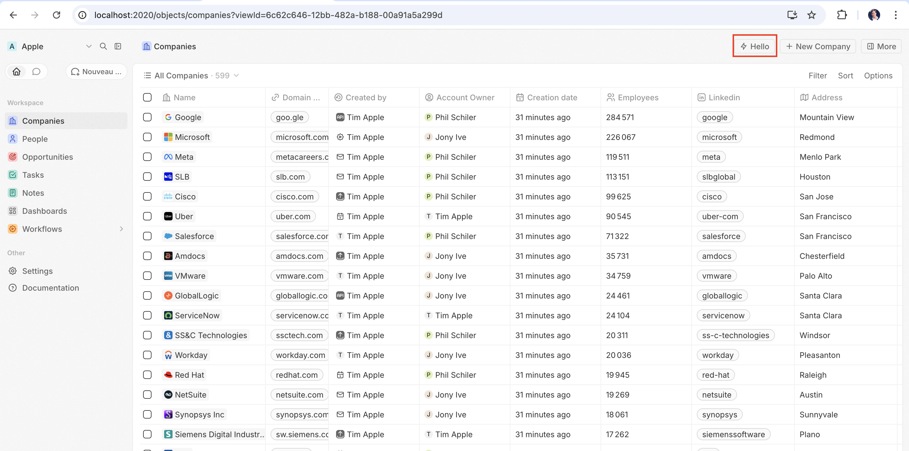
最快看到前端组件实际效果的方式是将它与defineCommandMenuItem配对,这样它就会显示为页面右上角的快速操作按钮:
src/front-components/hello-world.tsx
src/command-menu-items/hello-world.command-menu-item.ts
yarn twenty dev 同步后(或单次运行 yarn twenty dev --once),快速操作会出现在页面右上角:
配置字段
| 字段 | 必填 | 描述 |
|---|---|---|
universalIdentifier | 是 | 该组件的稳定唯一 ID |
component | 是 | 一个 React 组件函数 |
name | 否 | 显示名称 |
description | 否 | 组件的功能描述 |
isHeadless | 否 | 如果组件没有可见的 UI,则设为 true(见下文) |
在页面上放置前端组件
除了命令之外,你还可以在页面布局中将其添加为小部件,从而将前端组件直接嵌入记录页面。 详情请参见页面布局。无头与非无头
前端组件有两种由isHeadless 选项控制的渲染模式:
非无头(默认) — 该组件会渲染可见的 UI。 从命令菜单触发时,它会在侧边栏中打开。 当 isHeadless 为 false 或被省略时,这是默认行为。
无头 (isHeadless: true) — 该组件会在后台以不可见的方式挂载。 它不会打开侧边栏。 无头组件旨在用于执行逻辑后自行卸载的操作——例如运行异步任务、导航到某个页面或显示确认模态框。 它们与下文介绍的 SDK Command 组件天然契合。
src/front-components/sync-tracker.tsx
null,Twenty 会跳过为其渲染容器——布局中不会出现空白区域。 该组件仍可访问所有 hooks 和宿主通信 API。
SDK Command 组件
twenty-sdk 包提供了四个为无头前端组件设计的 Command 辅助组件。 每个组件都会在挂载时执行一个操作,通过显示 snackbar 通知来处理错误,并在完成后自动卸载该前端组件。
从 twenty-sdk/command 导入它们:
Command— 通过execute属性运行异步回调。CommandLink— 导航到某个应用路径。 属性:to、params、queryParams、options。CommandModal— 打开一个确认模态框。 如果用户确认,则执行execute回调。 属性:title、subtitle、execute、confirmButtonText、confirmButtonAccent。CommandOpenSidePanelPage— 打开特定的侧边栏页面。 属性:page、pageTitle、pageIcon。
Command 从命令菜单运行一个操作:
src/front-components/run-action.tsx
src/command-menu-items/run-action.command-menu-item.ts
CommandModal 在执行前请求确认:
src/front-components/delete-draft.tsx
调用逻辑函数
前端组件在沙盒 Web Worker 中于浏览器端运行,而逻辑函数在服务器端运行。 二者之间没有直接的进程内调用——前端组件通过 HTTP 访问逻辑函数。 使用httpRouteTriggerSettings 声明的逻辑函数会通过 /s/ 端点暴露在 ${TWENTY_API_URL}/s\<path> 下。 你的前端组件使用来自 twenty-client-sdk/rest 的 RestApiClient 调用该路由,该客户端会使用 Twenty 注入到 worker 中的 TWENTY_APP_ACCESS_TOKEN 进行身份验证。
RestApiClient 正是为这种场景而构建的。 它会从 worker 环境中读取 TWENTY_API_URL 和 TWENTY_APP_ACCESS_TOKEN,附加 Authorization: Bearer 请求头,对 JSON 进行序列化和解析,并在 token 或 URL 缺失或响应为非 2xx 时抛出 RestApiClientError——这样你就不必在每个组件中重复实现这些样板逻辑。
无头前端组件可以通过 Command 组件在挂载时执行调用,然后自动卸载:
src/front-components/sync-prs.tsx
httpRouteTriggerSettings.path,并以 /s 作为前缀。 保持 isAuthRequired: true;客户端会为你的组件提供由 Twenty 签发的应用访问令牌:
src/logic-functions/fetch-prs.logic-function.ts
TWENTY_API_URL 和 TWENTY_APP_ACCESS_TOKEN 会被自动注入——参见 应用变量。 由于机密应用变量永远不会暴露给前端组件,请将 API 密钥和其他敏感逻辑保留在逻辑函数中,而不是前端组件中。RestApiClient 参考
从twenty-client-sdk/rest 中导入 RestApiClient。 它与 CoreApiClient 和 MetadataApiClient 属于同一客户端家族,但目标是你应用的 HTTP 路由,而不是 GraphQL API。
| 方法 | 描述 |
|---|---|
get(path, options?) | 发送一个 GET 请求 |
post(path, body?, options?) | 发送一个 POST 请求 |
put(path, body?, options?) | 发送一个 PUT 请求 |
patch(path, body?, options?) | 发送一个 PATCH 请求 |
delete(path, options?) | 发送一个 DELETE 请求 |
request(method, path, options?) | 使用任意 HTTP 方法的通用请求 |
options 接受 headers、query(查询字符串参数记录;空值会被跳过),以及通过 signal 传入的 AbortSignal。 非 FormData 类型的对象 body 会被自动进行 JSON 序列化。 在收到 401 时,客户端会通过宿主刷新一次访问令牌,然后重试该请求。
基础 URL 和令牌默认会从环境中解析得到。 在需要时将覆盖项传递给构造函数——例如在测试中:
RestApiClientError,其中包含 status、statusText、url 和已解析的 body:
访问运行时上下文
在组件内部,使用 SDK 的 hooks 获取当前用户、记录和组件实例:src/front-components/record-info.tsx
| 钩子 | 返回值 | 描述 |
|---|---|---|
useUserId() | string 或 null | 当前用户的 ID |
useSelectedRecordIds() | 字符串[] | 所有已选择的记录 ID(如果未选择,则为空数组) |
useRecordId() | string 或 null | 已弃用。 请改用 useSelectedRecordIds() |
useFrontComponentId() | string | 此组件实例的 ID |
useColorScheme() | 'light' 或 'dark' | 宿主 UI 当前的配色方案(System 已解析) |
useFrontComponentExecutionContext(selector) | 因情况而异 | 使用选择器函数访问完整的执行上下文 |
应用程序变量
在defineApplication() 中定义、且 isSecret: false 的应用程序变量,可以通过 getApplicationVariable 实用工具在前端组件中使用:
src/front-components/greeting.tsx
process.env 获取:
| 变量 | 描述 |
|---|---|
TWENTY_API_URL | Twenty API 的基础 URL |
TWENTY_APP_ACCESS_TOKEN | 限定在你的应用角色范围内的短期令牌 |
宿主通信 API
前端组件可以使用来自twenty-sdk 的函数触发导航、模态框和通知:
| 函数 | 描述 |
|---|---|
navigate(to, params?, queryParams?, options?) | 在应用中导航到某个页面 |
openSidePanelPage(params) | 打开侧边栏 |
closeSidePanel() | 关闭侧边栏 |
openCommandConfirmationModal(params) | 显示确认对话框 |
enqueueSnackbar(params) | 显示一条 Toast 通知 |
unmountFrontComponent() | 卸载该组件 |
updateProgress(progress) | 更新进度指示器 |
src/front-components/archive-record.tsx
处理多个记录
使用useSelectedRecordIds() 来处理多个已选记录。 这对于批量操作很有用:
src/front-components/bulk-export.tsx
公共资源
前端组件可以使用getPublicAssetUrl 访问应用的 public/ 目录中的文件:
样式
前端组件支持多种样式方案。 你可以使用:- 内联样式 —
style={{ color: 'red' }} - Twenty UI 组件 — 从
twenty-sdk/ui导入(Button、Tag、Status、Chip、Avatar 等) - Emotion — 使用
@emotion/react的 CSS-in-JS - Styled-components —
styled.div模式 - Tailwind CSS — 工具类
- 任何 CSS-in-JS 库(与 React 兼容)