Available Widgets
Twenty provides various widget types to visualize your CRM data.Bar Charts
Display data as horizontal or vertical bars.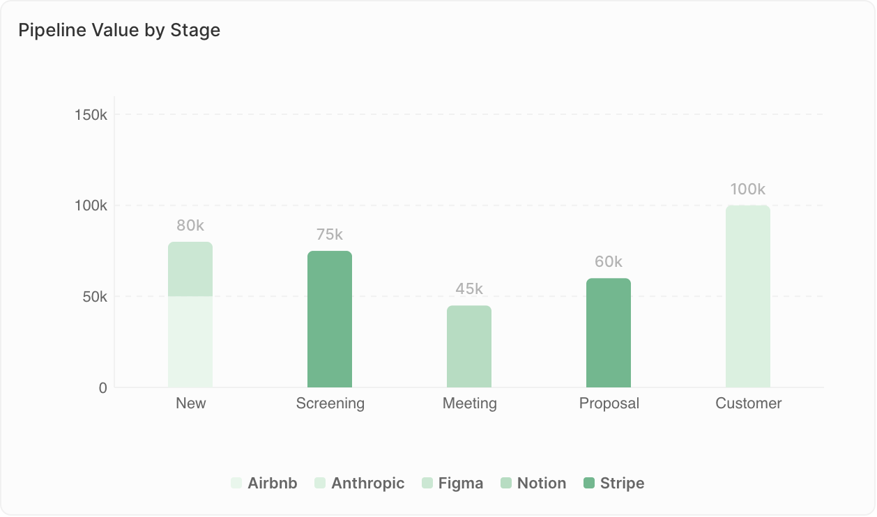
- Comparing values across categories
- Showing rankings
- Tracking metrics by time period
- Deals by stage
- Revenue by sales rep
- Contacts added per month
Display limits: Bar charts can show a maximum of 100 bars, and 50 groups per bar when using Group By. If you see the warning “Undisplayed data: max X bars per chart”, add filters to narrow down your data or change the grouping (e.g., group by week instead of days).
Pie Charts
Show proportions of a whole.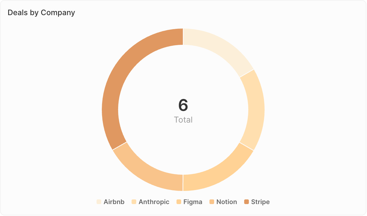
- Showing composition or distribution
- Comparing parts to whole
- Highlighting major segments
- Deal distribution by source
- Contact breakdown by industry
- Pipeline composition by owner
Line Charts
Display trends over time.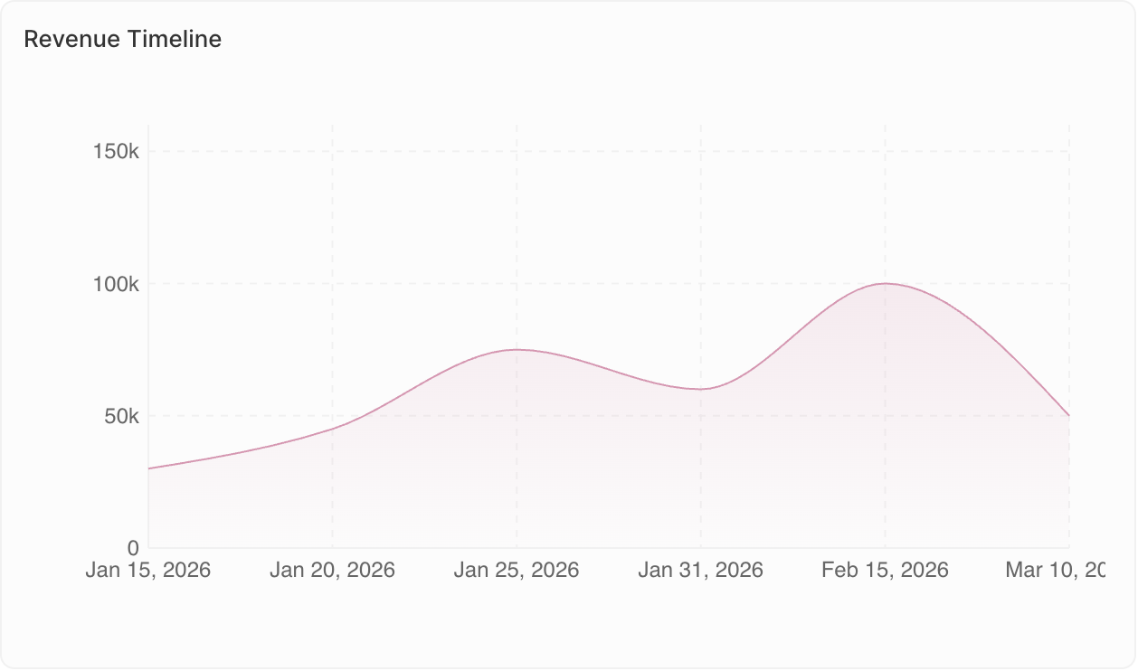
- Tracking changes over time
- Identifying trends
- Comparing multiple metrics
- Monthly deal count trend
- Revenue growth over quarters
- Activity levels over time
Aggregate Charts
Display single key values prominently.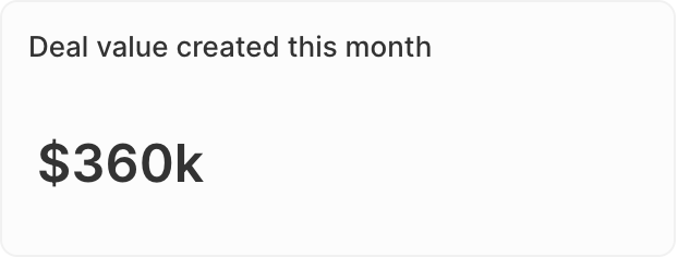
- Highlighting KPIs
- Showing totals or averages
- Quick status checks
- Total pipeline value
- Number of open opportunities
- Conversion rate
- Ratio: For Select fields, calculate ratios between values. Go to Data on display → select your field → enable the Ratio option.
- Prefix & Suffix: Add custom text before or after the number (e.g., ”$” prefix or ”%” suffix) for better readability.
iFrames
Embed external tools and content directly in your dashboard.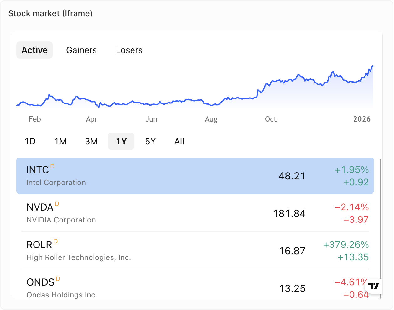
- Displaying external reports or dashboards
- Integrating third-party sales tools
- Showing live content from other systems
- Metrics from your Support tool
- Metrics from your dialer
- Live content from your Sales sequence tool
Rich Text
Add formatted text and content directly to your dashboard.
- Adding context or instructions
- Dashboard descriptions
- Notes and annotations
- Rich text formatting (bold, italic, lists, etc.)
- Image and file uploads
- Markdown-style editing
Coming soon: Gauge charts and tables are not yet available but are on our roadmap.
Duplicating Widgets
- Click on the widget
- Open Options
- Click Duplicate widget