跳转到主要内容
前端组件是直接在 Twenty 的 UI 内渲染的 React 组件。 它们在使用 Remote DOM 的隔离 Web Worker中运行——你的代码在沙盒中执行,但会原生渲染到页面中,而非在 iframe 里。

前端组件可用位置

在 Twenty 中,前端组件可在两个位置进行渲染:
  • 侧边栏 — 非无头的前端组件会在右侧侧边栏中打开。 当前端组件从命令菜单触发时,这是默认行为。
  • 小部件(仪表盘和记录页面) — 前端组件可以作为小部件嵌入页面布局中。 在配置仪表盘或记录页面布局时,用户可以添加前端组件小部件。

基础示例

最快体验前端组件运行方式的方法是将其注册为一个命令。 添加一个 command 字段并设置 isPinned: true,即可让它以快速操作按钮的形式出现在页面右上角——无需页面布局:
src/front-components/hello-world.tsx
import { defineFrontComponent } from 'twenty-sdk/define';

const HelloWorld = () => {
  return (
    <div style={{ padding: '20px', fontFamily: 'sans-serif' }}>
      <h1>Hello from my app!</h1>
      <p>This component renders inside Twenty.</p>
    </div>
  );
};

export default defineFrontComponent({
  universalIdentifier: '74c526eb-cb68-4cf7-b05c-0dd8c288d948',
  name: 'hello-world',
  description: 'A simple front component',
  component: HelloWorld,
  command: {
    universalIdentifier: 'd4e5f6a7-b8c9-0123-defa-456789012345',
    shortLabel: 'Hello',
    label: 'Hello World',
    icon: 'IconBolt',
    isPinned: true,
    availabilityType: 'GLOBAL',
  },
});
使用 
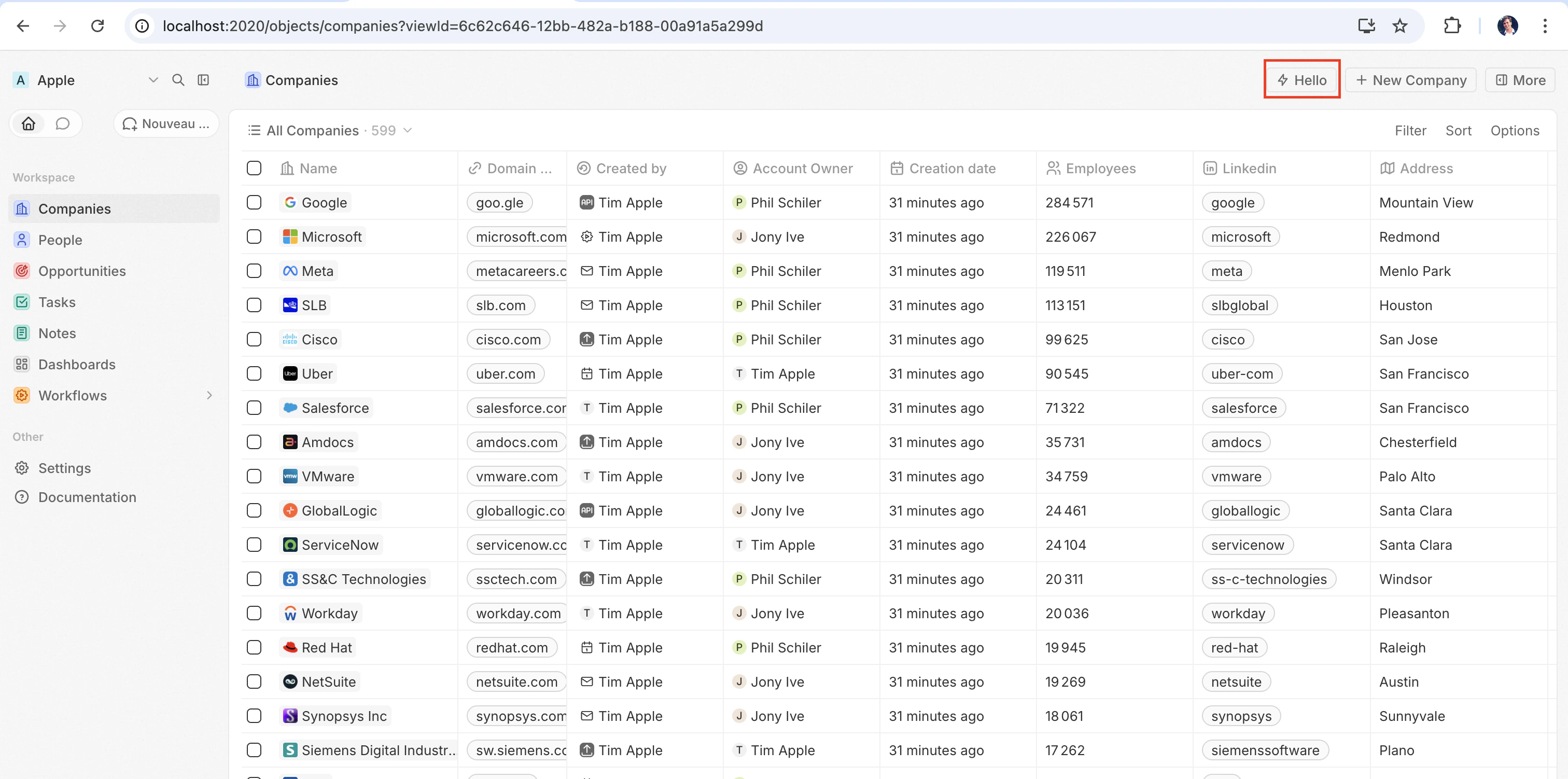
yarn twenty dev 同步后(或单次运行 yarn twenty dev --once),快速操作会出现在页面右上角:
右上角的快速操作按钮
点击它以内联方式渲染该组件。

配置字段

字段必填描述
universalIdentifier该组件的稳定唯一 ID
component一个 React 组件函数
name显示名称
描述组件的功能描述
isHeadlessSet to true if the component has no visible UI (see below)
命令Register the component as a command (see command options below)

Placing a front component on a page

Beyond commands, you can embed a front component directly into a record page by adding it as a widget in a page layout. See the definePageLayout section for details.

无头与非无头

前端组件有两种由 isHeadless 选项控制的渲染模式: 非无头(默认) — 该组件会渲染可见的 UI。 从命令菜单触发时,它会在侧边栏中打开。 当 isHeadlessfalse 或被省略时,这是默认行为。 无头 (isHeadless: true) — 该组件会在后台以不可见的方式挂载。 它不会打开侧边栏。 无头组件旨在用于执行逻辑后自行卸载的操作——例如运行异步任务、导航到某个页面或显示确认模态框。 它们与下文介绍的 SDK Command 组件天然契合。
src/front-components/sync-tracker.tsx
import { defineFrontComponent } from 'twenty-sdk/define';
import { useRecordId, enqueueSnackbar } from 'twenty-sdk/front-component';
import { useEffect } from 'react';

const SyncTracker = () => {
  const recordId = useRecordId();

  useEffect(() => {
    enqueueSnackbar({ message: `Tracking record ${recordId}`, variant: 'info' });
  }, [recordId]);

  return null;
};

export default defineFrontComponent({
  universalIdentifier: '...',
  name: 'sync-tracker',
  description: 'Tracks record views silently',
  isHeadless: true,
  component: SyncTracker,
});
Because the component returns null, Twenty skips rendering a container for it — no empty space appears in the layout. The component still has access to all hooks and the host communication API.

SDK Command 组件

twenty-sdk 包提供了四个为无头前端组件设计的 Command 辅助组件。 每个组件都会在挂载时执行一个操作,通过显示 snackbar 通知来处理错误,并在完成后自动卸载该前端组件。 twenty-sdk/command 导入它们:
  • Command — 通过 execute 属性运行异步回调。
  • CommandLink — 导航到某个应用路径。 属性:toparamsqueryParamsoptions
  • CommandModal — 打开一个确认模态框。 如果用户确认,则执行 execute 回调。 属性:titlesubtitleexecuteconfirmButtonTextconfirmButtonAccent
  • CommandOpenSidePanelPage — 打开特定的侧边栏页面。 属性:pagepageTitlepageIcon
下面是一个完整示例:无头前端组件使用 Command 从命令菜单运行一个操作:
src/front-components/run-action.tsx
import { defineFrontComponent } from 'twenty-sdk/define';
import { Command } from 'twenty-sdk/command';
import { CoreApiClient } from 'twenty-sdk/clients';

const RunAction = () => {
  const execute = async () => {
    const client = new CoreApiClient();

    await client.mutation({
      createTask: {
        __args: { data: { title: 'Created by my app' } },
        id: true,
      },
    });
  };

  return <Command execute={execute} />;
};

export default defineFrontComponent({
  universalIdentifier: 'e5f6a7b8-c9d0-1234-efab-345678901234',
  name: 'run-action',
  description: 'Creates a task from the command menu',
  component: RunAction,
  isHeadless: true,
  command: {
    universalIdentifier: 'f6a7b8c9-d0e1-2345-fabc-456789012345',
    label: 'Run my action',
    icon: 'IconPlayerPlay',
  },
});
另一个示例:使用 CommandModal 在执行前请求确认:
src/front-components/delete-draft.tsx
import { defineFrontComponent } from 'twenty-sdk/define';
import { CommandModal } from 'twenty-sdk/command';

const DeleteDraft = () => {
  const execute = async () => {
    // perform the deletion
  };

  return (
    <CommandModal
      title="Delete draft?"
      subtitle="This action cannot be undone."
      execute={execute}
      confirmButtonText="Delete"
      confirmButtonAccent="danger"
    />
  );
};

export default defineFrontComponent({
  universalIdentifier: 'a7b8c9d0-e1f2-3456-abcd-567890123456',
  name: 'delete-draft',
  description: 'Deletes a draft with confirmation',
  component: DeleteDraft,
  isHeadless: true,
  command: {
    universalIdentifier: 'b8c9d0e1-f2a3-4567-bcde-678901234567',
    label: 'Delete draft',
    icon: 'IconTrash',
  },
});

Accessing runtime context

Inside your component, use SDK hooks to access the current user, record, and component instance:
src/front-components/record-info.tsx
import { defineFrontComponent } from 'twenty-sdk/define';
import {
  useUserId,
  useRecordId,
  useFrontComponentId,
} from 'twenty-sdk/front-component';

const RecordInfo = () => {
  const userId = useUserId();
  const recordId = useRecordId();
  const componentId = useFrontComponentId();

  return (
    <div>
      <p>User: {userId}</p>
      <p>Record: {recordId ?? 'No record context'}</p>
      <p>Component: {componentId}</p>
    </div>
  );
};

export default defineFrontComponent({
  universalIdentifier: 'b2c3d4e5-f6a7-8901-bcde-f23456789012',
  name: 'record-info',
  component: RecordInfo,
});
Available hooks:
钩子Returns描述
useUserId()string or nullThe current user’s ID
useRecordId()string or nullThe current record’s ID (when placed on a record page)
useFrontComponentId()stringThis component instance’s ID
useFrontComponentExecutionContext(selector)因情况而异Access the full execution context with a selector function

Host communication API

Front components can trigger navigation, modals, and notifications using functions from twenty-sdk:
函数描述
navigate(to, params?, queryParams?, options?)Navigate to a page in the app
openSidePanelPage(params)Open a side panel
closeSidePanel()关闭侧边栏
openCommandConfirmationModal(params)Show a confirmation dialog
enqueueSnackbar(params)Show a toast notification
unmountFrontComponent()Unmount the component
updateProgress(progress)Update a progress indicator
下面是一个示例,使用宿主 API 在操作完成后显示一条 snackbar 并关闭侧边栏:
src/front-components/archive-record.tsx
import { defineFrontComponent } from 'twenty-sdk/define';
import { useRecordId } from 'twenty-sdk/front-component';
import { enqueueSnackbar, closeSidePanel } from 'twenty-sdk/front-component';
import { CoreApiClient } from 'twenty-sdk/clients';

const ArchiveRecord = () => {
  const recordId = useRecordId();

  const handleArchive = async () => {
    const client = new CoreApiClient();

    await client.mutation({
      updateTask: {
        __args: { id: recordId, data: { status: 'ARCHIVED' } },
        id: true,
      },
    });

    await enqueueSnackbar({
      message: 'Record archived',
      variant: 'success',
    });

    await closeSidePanel();
  };

  return (
    <div style={{ padding: '20px' }}>
      <p>Archive this record?</p>
      <button onClick={handleArchive}>Archive</button>
    </div>
  );
};

export default defineFrontComponent({
  universalIdentifier: 'c9d0e1f2-a3b4-5678-cdef-789012345678',
  name: 'archive-record',
  description: 'Archives the current record',
  component: ArchiveRecord,
});

Command options

Adding a command field to defineFrontComponent registers the component in the command menu (Cmd+K). If isPinned is true, it also appears as a quick-action button in the top-right corner of the page.
字段必填描述
universalIdentifierStable unique ID for the command
标签Full label shown in the command menu (Cmd+K)
shortLabelShorter label displayed on the pinned quick-action button
图标Icon name displayed next to the label (e.g. 'IconBolt', 'IconSend')
isPinnedWhen true, shows the command as a quick-action button in the top-right corner of the page
availabilityTypeControls where the command appears: 'GLOBAL' (always available), 'RECORD_SELECTION' (only when records are selected), or 'FALLBACK' (shown when no other commands match)
availabilityObjectUniversalIdentifierRestrict the command to pages of a specific object type (e.g. only on Company records)
conditionalAvailabilityExpressionA boolean expression to dynamically control whether the command is visible (see below)

Conditional availability expressions

The conditionalAvailabilityExpression field lets you control when a command is visible based on the current page context. Import typed variables and operators from twenty-sdk to build expressions:
import { defineFrontComponent } from 'twenty-sdk/define';
import {
  pageType,
  numberOfSelectedRecords,
  objectPermissions,
  everyEquals,
  isDefined,
} from 'twenty-sdk/front-component';

export default defineFrontComponent({
  universalIdentifier: '...',
  name: 'bulk-action',
  component: BulkAction,
  command: {
    universalIdentifier: '...',
    label: 'Bulk Update',
    availabilityType: 'RECORD_SELECTION',
    conditionalAvailabilityExpression: everyEquals(
      objectPermissions,
      'canUpdateObjectRecords',
      true,
    ),
  },
});
Context variables — these represent the current state of the page:
变量类型描述
pageTypestringCurrent page type (e.g. 'RecordIndexPage', 'RecordShowPage')
isInSidePanelbooleanWhether the component is rendered in a side panel
numberOfSelectedRecords数字Number of currently selected records
isSelectAllbooleanWhether “select all” is active
selectedRecordsarrayThe selected record objects
favoriteRecordIdsarrayIDs of favorited records
objectPermissions对象Permissions for the current object type
targetObjectReadPermissions对象Read permissions for the target object
targetObjectWritePermissions对象Write permissions for the target object
featureFlags对象Active feature flags
objectMetadataItem对象Metadata of the current object type
hasAnySoftDeleteFilterOnViewbooleanWhether the current view has a soft-delete filter
Operators — combine variables into boolean expressions:
Operator描述
isDefined(value)true if the value is not null/undefined
isNonEmptyString(value)true if the value is a non-empty string
includes(array, value)true if the array contains the value
includesEvery(array, prop, value)true if every item’s property includes the value
every(array, prop)true if the property is truthy on every item
everyDefined(array, prop)true if the property is defined on every item
everyEquals(array, prop, value)true if the property equals the value on every item
some(array, prop)true if the property is truthy on at least one item
someDefined(array, prop)true if the property is defined on at least one item
someEquals(array, prop, value)true if the property equals the value on at least one item
someNonEmptyString(array, prop)true if the property is a non-empty string on at least one item
none(array, prop)true if the property is falsy on every item
noneDefined(array, prop)true if the property is undefined on every item
noneEquals(array, prop, value)true if the property does not equal the value on any item

Public assets

Front components can access files from the app’s public/ directory using getPublicAssetUrl:
import { defineFrontComponent, getPublicAssetUrl } from 'twenty-sdk/define';

const Logo = () => <img src={getPublicAssetUrl('logo.png')} alt="Logo" />;

export default defineFrontComponent({
  universalIdentifier: '...',
  name: 'logo',
  component: Logo,
});
See the public assets section for details.

样式

Front components support multiple styling approaches. You can use:
  • Inline stylesstyle={{ color: 'red' }}
  • Twenty UI components — import from twenty-sdk/ui (Button, Tag, Status, Chip, Avatar, and more)
  • Emotion — CSS-in-JS with @emotion/react
  • Styled-componentsstyled.div patterns
  • Tailwind CSS — utility classes
  • Any CSS-in-JS library compatible with React
import { defineFrontComponent } from 'twenty-sdk/define';
import { Button, Tag, Status } from 'twenty-sdk/ui';

const StyledWidget = () => {
  return (
    <div style={{ padding: '16px', display: 'flex', gap: '8px' }}>
      <Button title="Click me" onClick={() => alert('Clicked!')} />
      <Tag text="Active" color="green" />
      <Status color="green" text="Online" />
    </div>
  );
};

export default defineFrontComponent({
  universalIdentifier: 'e5f6a7b8-c9d0-1234-efab-567890123456',
  name: 'styled-widget',
  component: StyledWidget,
});