Right now the objects are only reachable through Settings. Let’s give the app a real presence in the UI: list views, sidebar entries, a one-click Generate document command, a record-page front component to preview a document, and a native rich-text editor tab for templates.

Views and navigation

A view is a saved list of a given object. A navigation menu item puts that view in the sidebar.
import { defineView, ViewKey } from 'twenty-sdk/define';

export default defineView({
  universalIdentifier: DOCUMENTS_VIEW_UNIVERSAL_IDENTIFIER,
  name: 'All documents',
  objectUniversalIdentifier: DOCUMENT_OBJECT_UNIVERSAL_IDENTIFIER,
  icon: 'IconFile',
  key: ViewKey.INDEX,
  position: 0,
  fields: [
    { universalIdentifier: DOCUMENTS_VIEW_NAME_FIELD_UNIVERSAL_IDENTIFIER,
      fieldMetadataUniversalIdentifier: DOCUMENT_NAME_FIELD_UNIVERSAL_IDENTIFIER,
      position: 0, isVisible: true, size: 280 },
    { universalIdentifier: DOCUMENTS_VIEW_STATUS_FIELD_UNIVERSAL_IDENTIFIER,
      fieldMetadataUniversalIdentifier: DOCUMENT_STATUS_FIELD_UNIVERSAL_IDENTIFIER,
      position: 1, isVisible: true, size: 120 },
    { universalIdentifier: DOCUMENTS_VIEW_TEMPLATE_FIELD_UNIVERSAL_IDENTIFIER,
      fieldMetadataUniversalIdentifier: DOCUMENT_TEMPLATE_FIELD_UNIVERSAL_IDENTIFIER,
      position: 2, isVisible: true, size: 200 },
  ],
});
import { defineNavigationMenuItem, NavigationMenuItemType } from 'twenty-sdk/define';

export default defineNavigationMenuItem({
  universalIdentifier: DOCUMENTS_NAVIGATION_MENU_ITEM_UNIVERSAL_IDENTIFIER,
  name: 'Documents',
  icon: 'IconFile',
  color: 'green',
  position: 1,
  type: NavigationMenuItemType.VIEW,
  viewUniversalIdentifier: DOCUMENTS_VIEW_UNIVERSAL_IDENTIFIER,
});
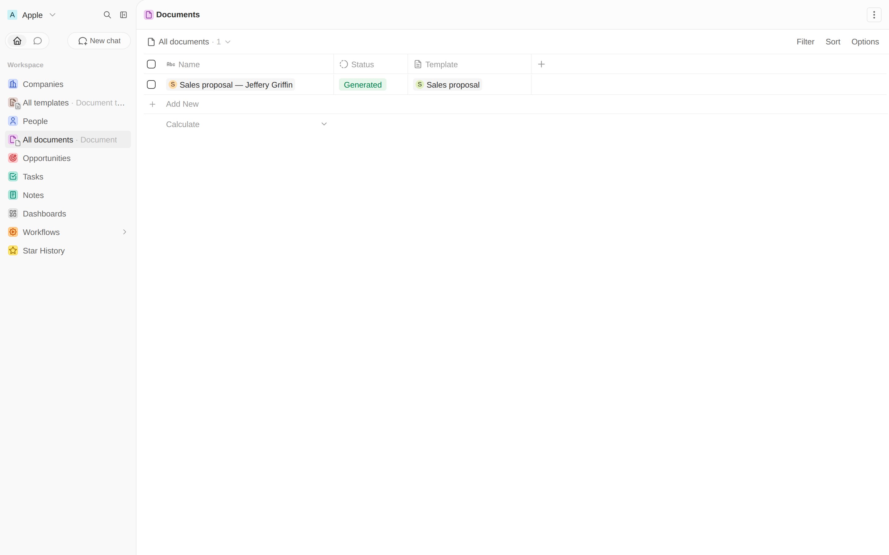
Add the same pair for templates. Both now show in the sidebar:
Documents view with a generated document

A front component

A front component is a React component sandboxed inside Twenty. Ours reads the selected record, loads the person templates via CoreApiClient, and POSTs to the route from the last chapter.
import { useEffect, useState } from 'react';
import { CoreApiClient } from 'twenty-client-sdk/core';
import { defineFrontComponent } from 'twenty-sdk/define';
import { enqueueSnackbar, useSelectedRecordIds } from 'twenty-sdk/front-component';

const GenerateDocumentForm = () => {
  const selectedRecordIds = useSelectedRecordIds();
  const recordId = selectedRecordIds.length === 1 ? selectedRecordIds[0] : null;
  const [templates, setTemplates] = useState<{ id: string; name: string }[]>([]);
  const [templateId, setTemplateId] = useState('');

  useEffect(() => {
    new CoreApiClient()
      .query({ documentTemplates: {
        __args: { filter: { target: { eq: 'PERSON' } }, first: 100 },
        edges: { node: { id: true, name: true } } } })
      .then(({ documentTemplates }) => {
        const list = documentTemplates?.edges?.map((e) => e.node) ?? [];
        setTemplates(list);
        if (list[0]) setTemplateId(list[0].id);
      });
  }, []);

  const generate = async () => {
    const apiBaseUrl = process.env.TWENTY_API_URL;
    const token = process.env.TWENTY_APP_ACCESS_TOKEN ?? process.env.TWENTY_API_KEY;
    const res = await fetch(`${apiBaseUrl}/s/documents/generate`, {
      method: 'POST',
      headers: { 'Content-Type': 'application/json', Authorization: `Bearer ${token}` },
      body: JSON.stringify({ templateId, recordId }),
    }).then((r) => r.json());
    await enqueueSnackbar({
      message: res.success ? 'Document generated.' : 'Generation failed.',
      variant: res.success ? 'success' : 'error',
    });
  };

  // ...render a <select> of templates and a Generate button
};

export default defineFrontComponent({
  universalIdentifier: GENERATE_DOCUMENT_FORM_FRONT_COMPONENT_UNIVERSAL_IDENTIFIER,
  name: 'generate-document-form',
  component: GenerateDocumentForm,
});
Style with inline CSS variables (var(--t-color-blue)), not values imported from twenty-ui. The SDK mocks that package during build, so module-level imports of theme constants would be undefined. See the full component.

A command to open it

A command menu item with availabilityType: 'RECORD_SELECTION' shows up when a Person is selected, and opens the component in the side panel.
import { defineCommandMenuItem, STANDARD_OBJECT_UNIVERSAL_IDENTIFIERS } from 'twenty-sdk/define';

export default defineCommandMenuItem({
  universalIdentifier: GENERATE_DOCUMENT_COMMAND_UNIVERSAL_IDENTIFIER,
  label: 'Generate document',
  availabilityType: 'RECORD_SELECTION',
  availabilityObjectUniversalIdentifier:
    STANDARD_OBJECT_UNIVERSAL_IDENTIFIERS.person.universalIdentifier,
  frontComponentUniversalIdentifier:
    GENERATE_DOCUMENT_FORM_FRONT_COMPONENT_UNIVERSAL_IDENTIFIER,
});

Try the whole flow

Open People, tick a person, and press ⌘K / Ctrl K. “Generate document” appears, tagged with your app:
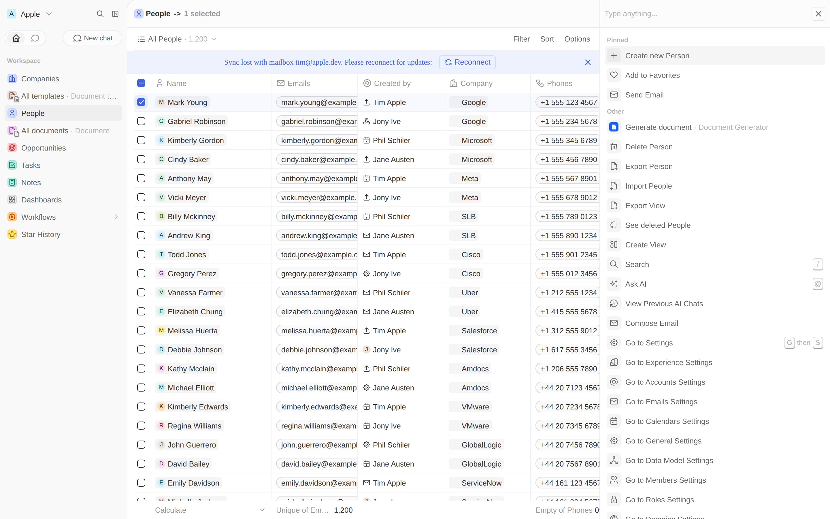
Command menu with Generate document
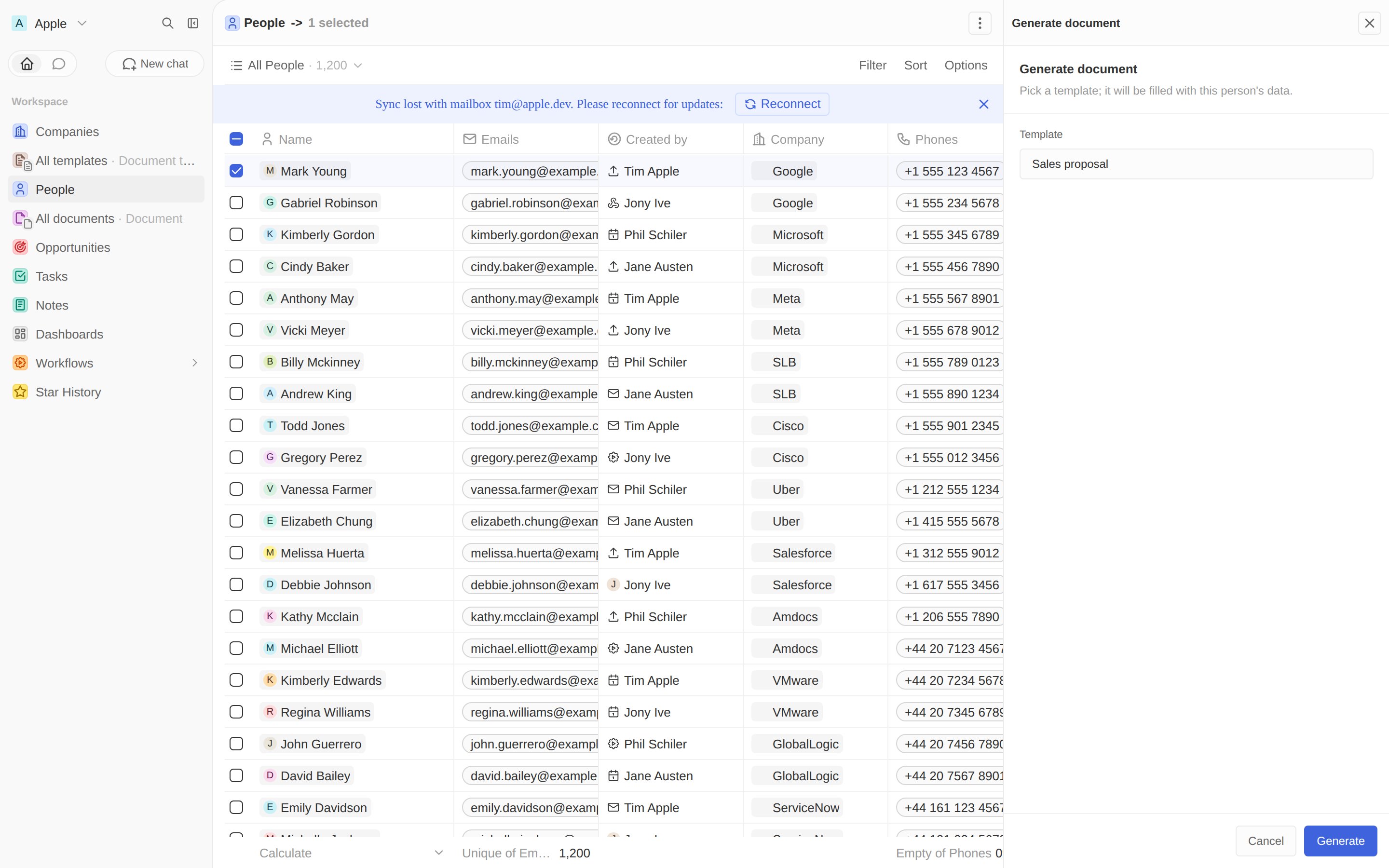
Run it — your component opens in the side panel. Pick a template, click Generate, and a new record lands in Documents.
Generate document side panel
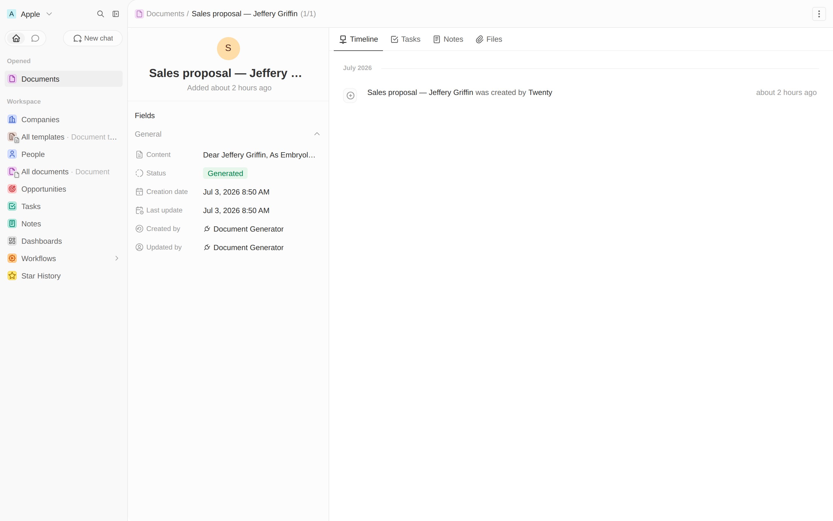
Every generated document records your app as its author:
A generated document record

Preview a document on its record page

A front component isn’t only for command menus — you can mount one as a tab on a record page. Let’s add a Preview tab to the document record that renders the Markdown body as a polished, printable page. The component reads the current record id from its execution context, loads the document, and renders it. Front components run in a sandbox that only allows a whitelist of HTML tags — raw HTML injection (dangerouslySetInnerHTML) and <style> are blocked — so we render the Markdown as React elements with inline styles via a small Markdown helper.
import { CoreApiClient } from 'twenty-client-sdk/core';
import { defineFrontComponent } from 'twenty-sdk/define';
import { useFrontComponentExecutionContext } from 'twenty-sdk/front-component';
import { Markdown } from 'src/utils/markdown-to-react';

const DocumentViewer = () => {
  const recordId = useFrontComponentExecutionContext((c) => c.recordId ?? null);
  // ...load { content, file } for recordId, then derive the links:
  const pdfUrl = document.file?.[0]?.url;
  const webUrl = `${process.env.TWENTY_API_URL ?? ''}/s/documents/view?id=${recordId}`;

  // Render the template body, plus quick links to the web page and the PDF.
  // Links open in a new tab so they don't navigate the embedded component.
  return (
    <div style={styles.scroll}>
      <div style={styles.actions}>
        <a style={styles.actionLink} href={webUrl} target="_blank" rel="noopener noreferrer">
          Open web page
        </a>
        {pdfUrl ? (
          <a style={styles.actionLink} href={pdfUrl} target="_blank" rel="noopener noreferrer">
            Download PDF
          </a>
        ) : null}
      </div>
      <div style={styles.paper}>
        <div style={styles.body}>
          <Markdown content={document.content} />
        </div>
      </div>
    </div>
  );
};

export default defineFrontComponent({
  universalIdentifier: DOCUMENT_VIEWER_FRONT_COMPONENT_UNIVERSAL_IDENTIFIER,
  name: 'document-viewer',
  component: DocumentViewer,
});
Mount it with a page layout. A RECORD_PAGE layout adds tabs to an object’s record view; a FRONT_COMPONENT widget in a CANVAS tab hosts the component:
import { definePageLayout, PageLayoutTabLayoutMode } from 'twenty-sdk/define';

export default definePageLayout({
  universalIdentifier: DOCUMENT_PAGE_LAYOUT_UNIVERSAL_IDENTIFIER,
  name: 'Document record page',
  type: 'RECORD_PAGE',
  objectUniversalIdentifier: DOCUMENT_OBJECT_UNIVERSAL_IDENTIFIER,
  tabs: [{
    universalIdentifier: DOCUMENT_PAGE_LAYOUT_TAB_UNIVERSAL_IDENTIFIER,
    title: 'Preview',
    icon: 'IconEye',
    position: 50,
    layoutMode: PageLayoutTabLayoutMode.CANVAS,
    widgets: [{
      universalIdentifier: DOCUMENT_PAGE_LAYOUT_WIDGET_UNIVERSAL_IDENTIFIER,
      title: 'Document preview',
      type: 'FRONT_COMPONENT',
      configuration: {
        configurationType: 'FRONT_COMPONENT',
        frontComponentUniversalIdentifier: DOCUMENT_VIEWER_FRONT_COMPONENT_UNIVERSAL_IDENTIFIER,
      },
    }],
  }],
});
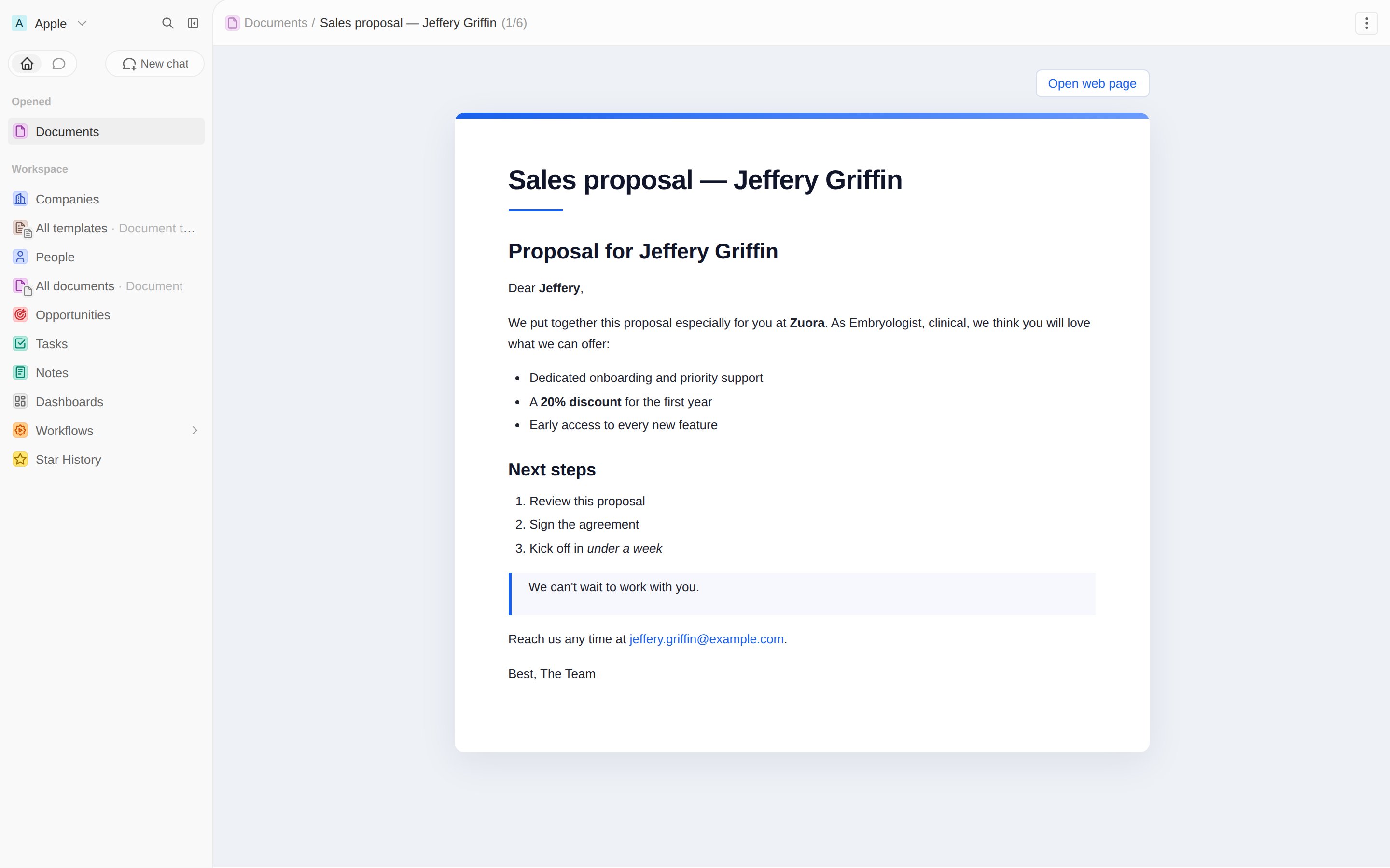
Open any document — a Preview tab renders it beautifully, with links to the shareable web page and the PDF:
Document viewer front component in a record-page tab

Edit a template with the rich-text editor

Templates don’t need a custom component at all. Because the body is a RICH_TEXT field, Twenty already provides a full rich-text editor for it — the same one the standard Note and Task objects use. We just surface it on the template record page. Add a tab with a FIELD widget in EDITOR display mode, pointing at the body field via fieldMetadataId:
{
  universalIdentifier: TEMPLATE_PAGE_LAYOUT_TAB_UNIVERSAL_IDENTIFIER,
  title: 'Template',
  position: 1,
  layoutMode: PageLayoutTabLayoutMode.GRID,
  widgets: [{
    universalIdentifier: TEMPLATE_PAGE_LAYOUT_WIDGET_UNIVERSAL_IDENTIFIER,
    title: 'Template',
    type: 'FIELD',
    gridPosition: { row: 0, column: 0, rowSpan: 6, columnSpan: 12 },
    configuration: {
      configurationType: 'FIELD',
      fieldMetadataId: TEMPLATE_BODY_FIELD_UNIVERSAL_IDENTIFIER,
      fieldDisplayMode: 'EDITOR',
    },
  }],
}
A RICH_TEXT field stores both the editor’s block JSON and a Markdown projection. The generation pipeline reads that Markdown projection, so placeholders, the PDF, and the shareable web page all keep working unchanged — see the full template-record.page-layout.ts. Now editors write templates in a proper rich-text editor:
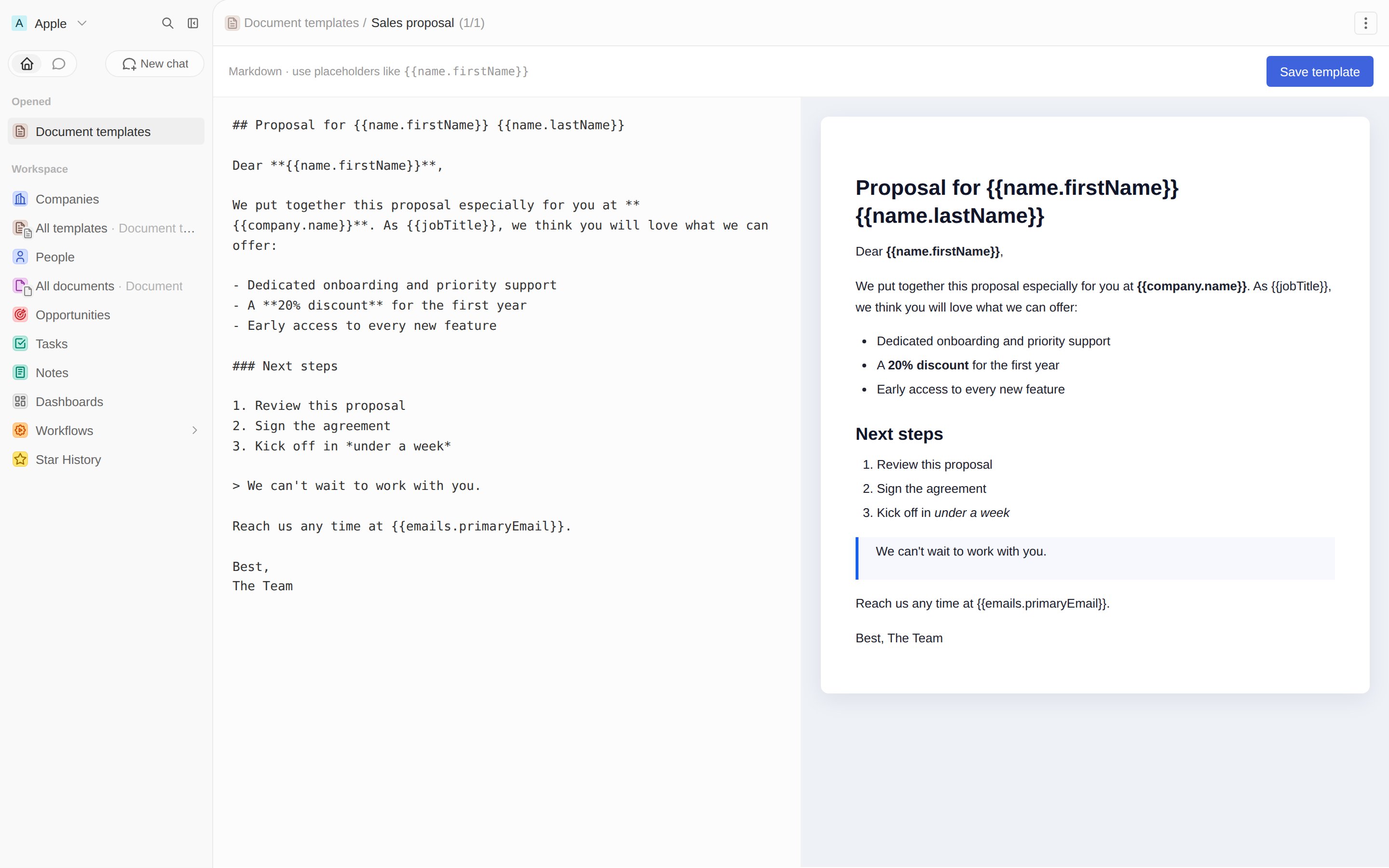
Template record with the native rich-text editor tab
After this step: documents preview beautifully and templates are editable in-app. Next, let an AI agent generate them from a chat.

Next: an AI agent →

Add an agent and a skill that call your tool.