Diagramm-Einstellungen aufrufen
- Klicken Sie auf die Schaltfläche Bearbeiten in der oberen rechten Ecke Ihres Dashboards
- Das Dashboard wechselt in den Bearbeitungsmodus
- Klicken Sie auf ein beliebiges Widget, um es auszuwählen
- Der Einstellungsbereich öffnet sich rechts
- Daten: Welche Daten abgerufen werden und wie sie gefiltert werden
- X-Achse: Wie Kategorien gruppiert und sortiert werden (Balken-/Liniendiagramme)
- Y-Achse: Was gemessen wird und wie es angezeigt wird (Balken-/Liniendiagramme)
- Stil: Farben, Beschriftungen und visuelle Optionen
Einige Einstellungen erscheinen nur, wenn andere Einstellungen konfiguriert sind. Beispielsweise wird Datumsgranularität nur angezeigt, wenn Sie ein Datumsfeld auswählen.
Daten-Einstellungen
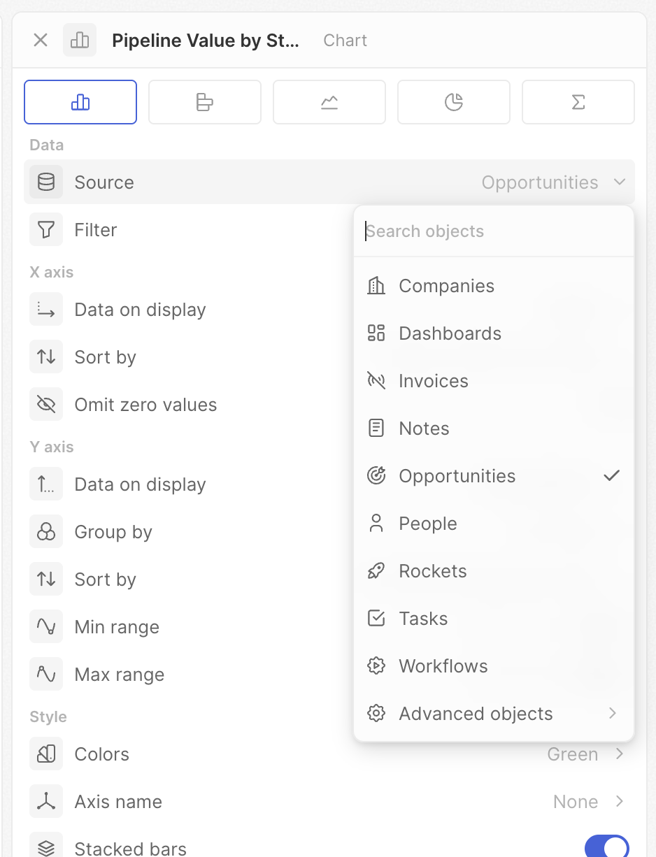
Quelle
Wählen Sie, aus welchem Objekt Daten abgerufen werden sollen.- Klicken Sie auf Quelle
- Wählen Sie ein Objekt (Chancen, Personen, Unternehmen usw.)
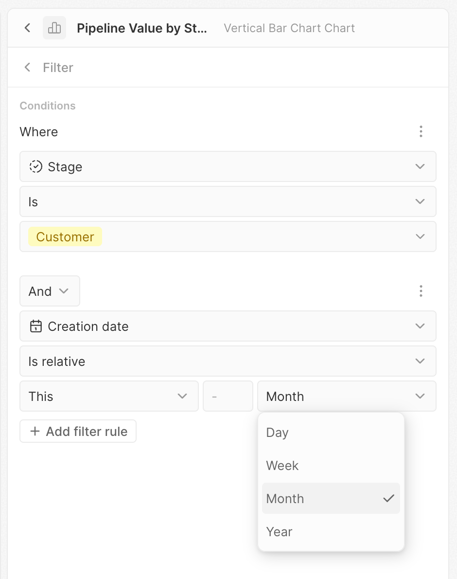
Filter
Begrenzen Sie, welche Datensätze in das Diagramm einbezogen werden.- Klicken Sie auf Filter
- Der Filter-Editor wird geöffnet
- Klicken Sie auf + Filter hinzufügen
- Wählen Sie ein Feld, eine Bedingung und einen Wert
- Fügen Sie bei Bedarf weitere Filter hinzu
Einstellungen der X-Achse
Diese Einstellungen steuern die horizontale Achse von Balken- und Liniendiagrammen — typischerweise, wie Ihre Daten in Kategorien gruppiert werden.Angezeigte Daten
Wählen Sie das Feld aus, nach dem Ihre Daten gruppiert werden sollen. Dies bestimmt die auf der X-Achse angezeigten Kategorien. Beispiel: Wählen Sie “Phase”, um Daten nach Pipeline-Phase zu gruppieren, oder “Erstellungsdatum”, um Daten über die Zeit zu sehen.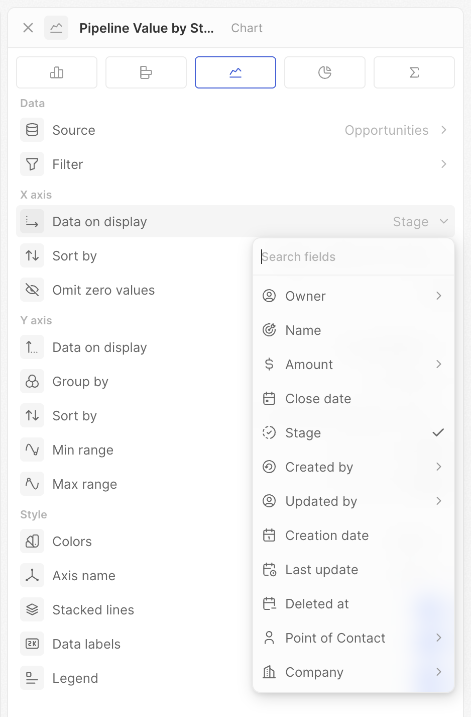
Datumsgranularität
Beim Gruppieren nach einem Datumsfeld wählen Sie den Zeitraum für die Gruppierung.
Die “der Woche/des Jahres”-Optionen aggregieren über die gesamte Zeit. Verwenden Sie Wochentag, um zu sehen, welcher Wochentag typischerweise die meisten Deals bringt. Verwenden Sie Monat, um Trends Monat für Monat zu sehen.
Sortieren nach
Steuern Sie die Reihenfolge der Kategorien auf der X-Achse.- Position – Verwendet die in den Einstellungen Ihres Auswahlfelds definierte Reihenfolge
- Alphabetisch – A bis Z (oder chronologisch bei Daten)
- Nach Wert – Nach der Kennzahl sortiert (höchste oder niedrigste zuerst)
- Manuell – Ziehen Sie, um Ihre eigene Reihenfolge festzulegen
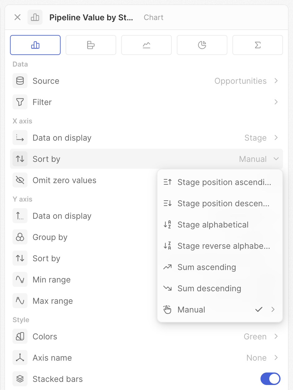
Die angezeigten Optionen hängen von Ihrem Feldtyp ab. Auswahlfelder haben alle Optionen; Datums- und Textfelder zeigen weniger.
Nullwerte auslassen
Kategorien mit Nullwerten oder ohne Daten ausblenden.- Ein: Kategorien ohne Einträge werden ausgeblendet
- Aus: Alle Kategorien werden angezeigt, auch wenn sie leer sind
Einstellungen der Y-Achse
Diese Einstellungen steuern, was Sie messen und wie es angezeigt wird.Angezeigte Daten
Wählen Sie das Feld und die Operation zur Berechnung Ihrer Kennzahl.- Zählungen – Alle zählen, Leere zählen, Nicht-Leere zählen, Eindeutige Werte zählen
- Mathematik – Summe, Durchschnitt, Min, Max (Zahlenfelder)
- Prozentsätze – Prozent leer, Prozent nicht leer
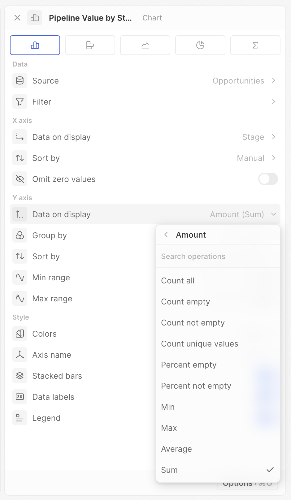
Die angezeigten Optionen hängen von Ihrem Feld- und Diagrammtyp ab. Wenn eine erwartete Operation nicht angezeigt wird, überprüfen Sie Ihren Feldtyp.
Verhältnis
Für Auswahl-, Mehrfachauswahl- oder Boolesche Felder können Sie den Prozentsatz eines bestimmten Werts berechnen.- Wählen Sie ein Auswahl-, Mehrfachauswahl- oder Boolesches Feld aus
- Aktivieren Sie Verhältnis
- Wählen Sie die zu messende Option
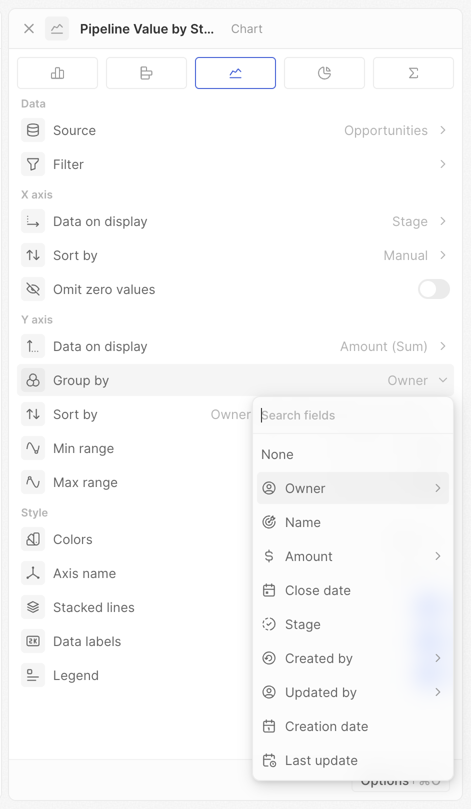
Gruppieren nach
Fügen Sie eine zweite Dimension hinzu, um mehrere Reihen zu erstellen (mehrere Balken oder Linien).- Legen Sie zuerst Ihr X-Achsen-Feld fest
- Klicken Sie auf Gruppieren nach
- Wählen Sie ein zweites Feld aus
Datumsgranularität
Wenn Gruppieren nach ein Datumsfeld ist, wählen Sie den Zeitraum (gleiche Optionen wie bei der X-Achse).Sortieren nach
Wenn Gruppieren nach eingestellt ist, steuern Sie die Reihenfolge der gruppierten Reihen (z. B. welcher Balken des Inhabers innerhalb jeder Kategorie zuerst erscheint). Gleiche Optionen wie bei der Sortierung der X-Achse — Position, Alphabetisch und Manuell — außer dass wertbasierte Sortierung für die sekundäre Gruppierung nicht verfügbar ist.Kumulativ
Laufende Summen statt einzelner Werte anzeigen.- Aus: Jeder Balken/Punkt zeigt seinen eigenen Wert
- Ein: Jeder Balken/Punkt zeigt die Summe aller vorherigen Werte plus seinen eigenen
- Kumulativ aus: Zeigt 10 und 15
- Kumulativ ein: Zeigt 10 und 25 (10 + 15)
Min-Bereich / Max-Bereich
Legen Sie feste Mindest- und Höchstwerte für die Y-Achse fest.- Leer lassen für automatische Skalierung
- Geben Sie eine Zahl ein, um die Grenze festzulegen
- Setzen Sie Min auf 0 für genaue visuelle Vergleiche
- Setzen Sie beides für konsistente Skalen über mehrere Diagramme hinweg
- Fokussieren Sie einen bestimmten Wertebereich, indem Sie beide festlegen
Stil-Einstellungen
Farben
Legen Sie das Farbschema für Ihr Diagramm fest. Wählen Sie aus einer Vielzahl von Farbpaletten.Beim Gruppieren nach einem Auswahlfeld verwendet das Diagramm automatisch die in Ihren Feldeinstellungen für jede Option definierten Farben.
Achsenname
Wählen Sie, welche Achsenbeschriftungen angezeigt werden sollen: Keine, X-Achse, Y-Achse oder Beide (nur Balken- und Liniendiagramme).Gestapelte Balken / Gestapelte Linien
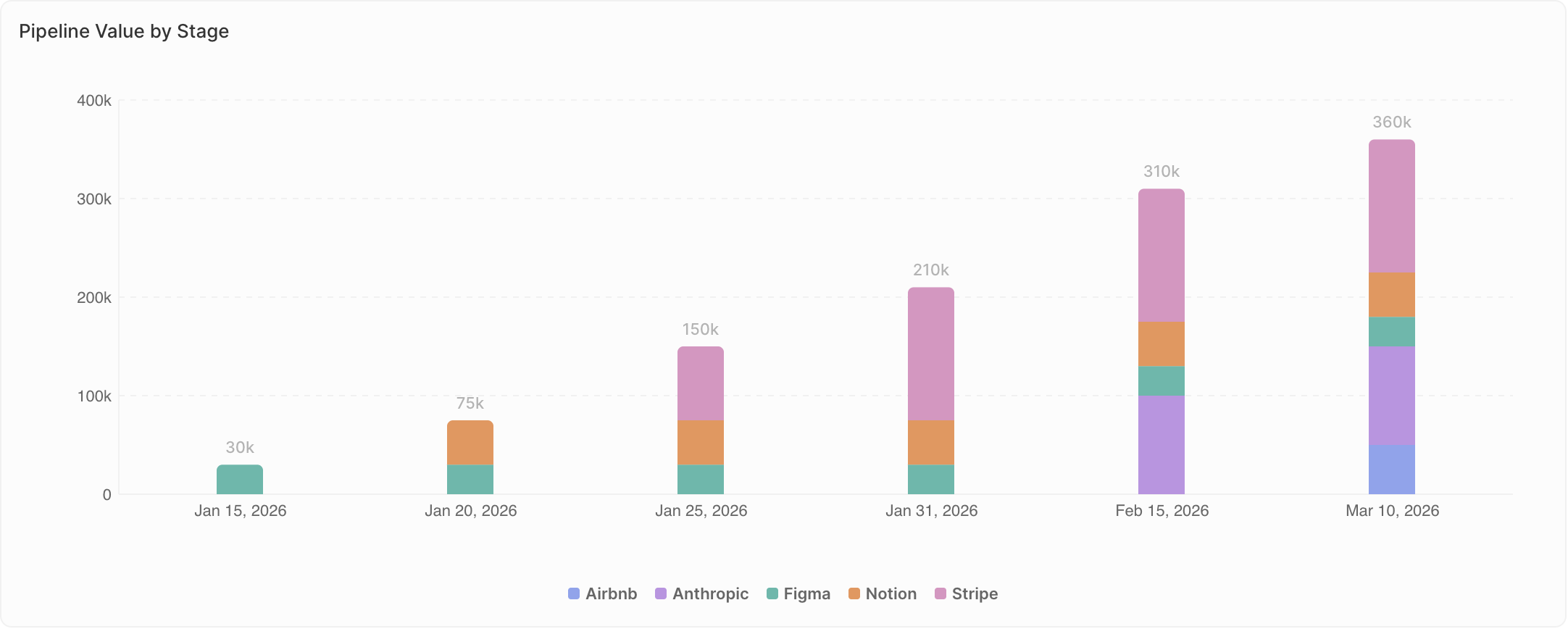
Wenn Gruppieren nach eingestellt ist, wählen Sie, wie mehrere Reihen angezeigt werden.- Aus (Gruppiert): Reihen erscheinen nebeneinander. Verwenden Sie dies, wenn exakte Werte zwischen Gruppen verglichen werden.
- Ein (Gestapelt): Reihen werden übereinander gestapelt. Verwenden Sie dies, wenn Sie die Zusammensetzung zeigen — wie Teile ein Ganzes bilden.
- Gruppiert: Sehen Sie die exakten Zahlen jedes Inhabers nebeneinander
- Gestapelt: Sehen Sie die Gesamtzahl der Deals pro Phase, mit dem gestapelten Beitrag jedes Inhabers
Datenbeschriftungen
Werte direkt auf Diagrammelementen (Balken, Punkte, Segmente) anzeigen.- Ein: Werte erscheinen im Diagramm
- Aus: Keine Werte angezeigt (aufgeräumtere Darstellung)
Legende
Legende anzeigen oder ausblenden (erscheint nur, wenn Gruppieren nach eingestellt ist).- Ein: Die Legende zeigt, was jede Farbe darstellt
- Aus: Keine Legende angezeigt
Diagrammspezifische Hinweise
Tortendiagramme
- Jedes Segment steht für – Legen Sie fest, wie Segmente gruppiert werden
- Leere Kategorie ausblenden – Nullwert-Segmente entfernen
- Wert in der Mitte anzeigen – Den aggregierten Wert anzeigen (Summe, Durchschnitt, Anzahl usw.)
Aggregierte Diagramme
- Präfix – Text vor der Zahl hinzufügen (z. B.
$) - Suffix – Text nach der Zahl hinzufügen (z. B.
%)