Accesso alle impostazioni del grafico
- Fai clic sul pulsante Modifica nell’angolo in alto a destra della dashboard
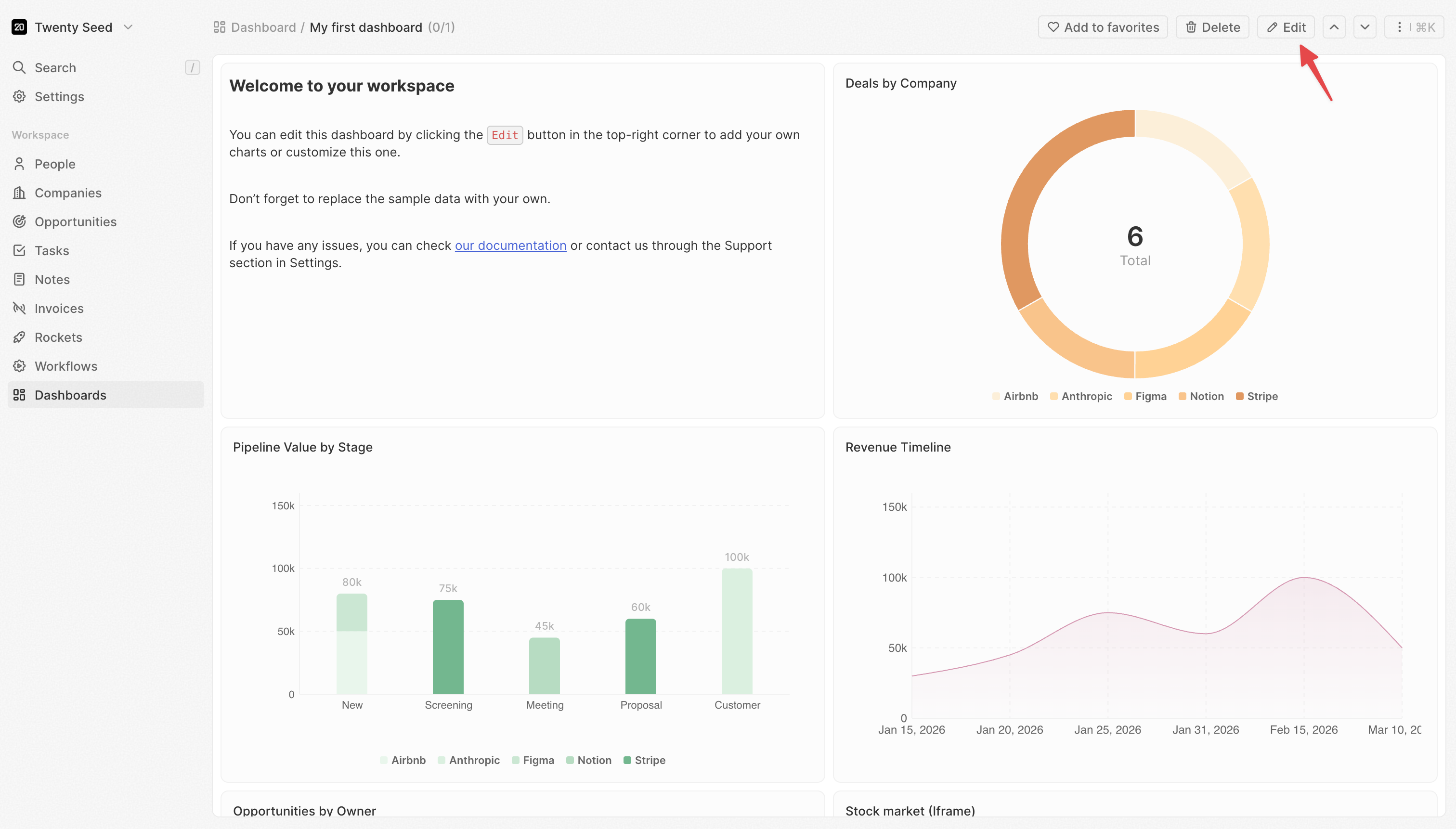
- La dashboard entra in modalità modifica
- Fai clic su qualsiasi widget per selezionarlo
- Il pannello delle impostazioni si apre a destra
- Dati: quali dati recuperare e come filtrarli
- Asse X: come raggruppare e ordinare le categorie (grafici a barre/a linee)
- Asse Y: cosa misurare e come visualizzarlo (grafici a barre/a linee)
- Stile: colori, etichette e opzioni di visualizzazione
Alcune impostazioni compaiono solo quando ne sono configurate altre. Ad esempio, Granularità della data compare solo quando selezioni un campo data.
Impostazioni dati
Origine
Scegli da quale oggetto recuperare i dati.- Fai clic su Origine
- Seleziona un oggetto (Opportunità, Persone, Aziende, ecc.)
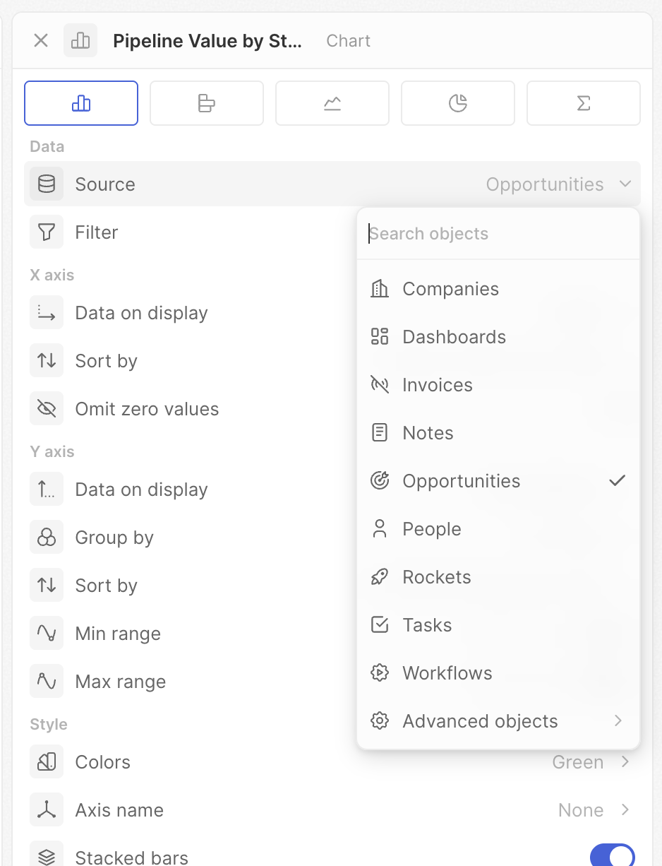
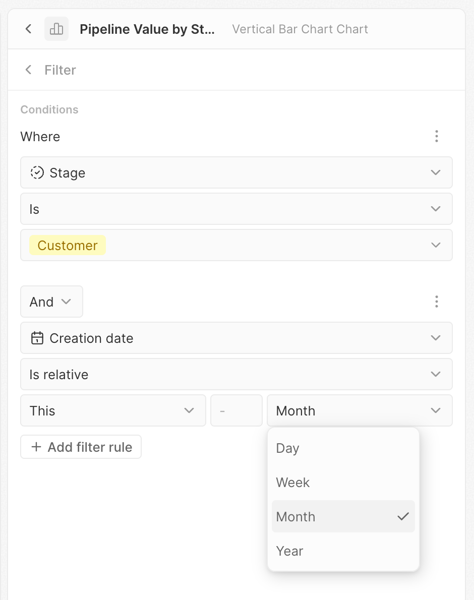
Filtro
Limita quali record sono inclusi nel grafico.- Fai clic su Filtro
- Si apre il generatore di filtri
- Fai clic su + Aggiungi filtro
- Seleziona un campo, una condizione e un valore
- Aggiungi altri filtri secondo necessità
Impostazioni asse X
Queste impostazioni controllano l’asse orizzontale dei grafici a barre e a linee: in genere come i dati vengono raggruppati in categorie.Dati visualizzati
Seleziona il campo in base al quale raggruppare i dati. Questo determina le categorie mostrate sull’asse X. Esempio: seleziona “Fase” per vedere i dati raggruppati per fase della pipeline oppure “Data di creazione” per vedere i dati nel tempo.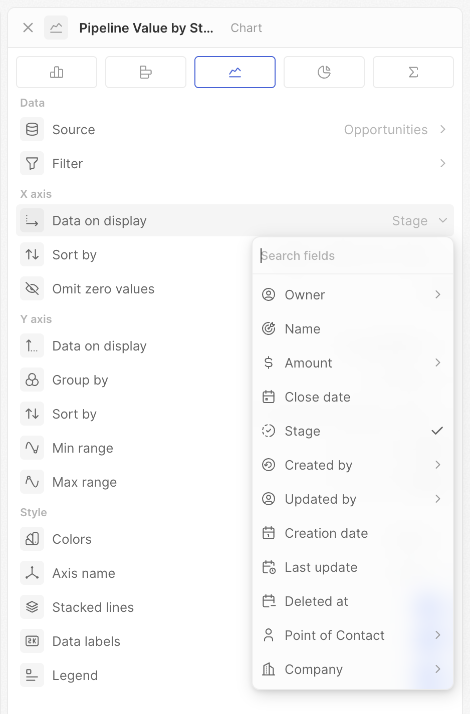
Granularità della data
Quando raggruppi per un campo data, scegli il periodo temporale per il raggruppamento.
Le opzioni “della settimana/dell’anno” aggregano su tutto il periodo. Usa Giorno della settimana per vedere quale giorno della settimana in genere ottiene più trattative. Usa Mese per vedere le tendenze mese per mese.
Ordina per
Controlla l’ordine delle categorie sull’asse X.- Posizione – usa l’ordine definito nelle impostazioni del campo Selezione
- Alfabetico – dalla A alla Z (o cronologico per le date)
- Per valore – ordinato per metrica (prima il più alto o il più basso)
- Manuale – trascina per impostare un ordine personalizzato
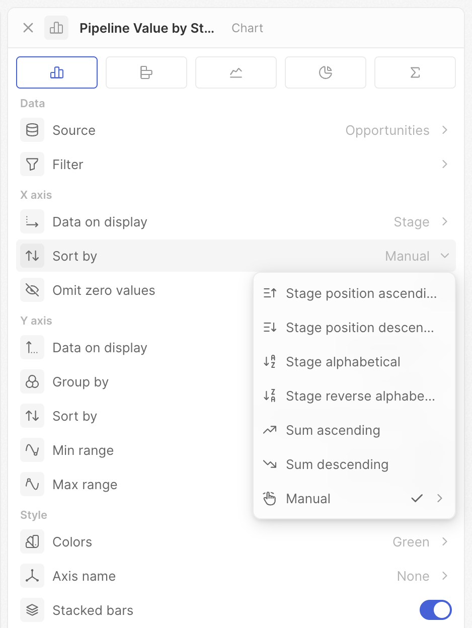
Le opzioni mostrate dipendono dal tipo di campo. I campi Selezione hanno tutte le opzioni; i campi data e testo ne mostrano di meno.
Ometti i valori zero
Nascondi le categorie che hanno zero dati o nessun dato.- Attivo: le categorie senza record vengono nascoste
- Disattivo: tutte le categorie vengono mostrate, anche se vuote
Impostazioni asse Y
Queste impostazioni controllano cosa stai misurando e come viene visualizzato.Dati visualizzati
Seleziona il campo e l’operazione per calcolare la tua metrica.- Conteggi – Conta tutti, Conta vuoti, Conta non vuoti, Conta valori univoci
- Matematica – Somma, Media, Min, Max (campi numerici)
- Percentuali – Percentuale vuoti, Percentuale non vuoti
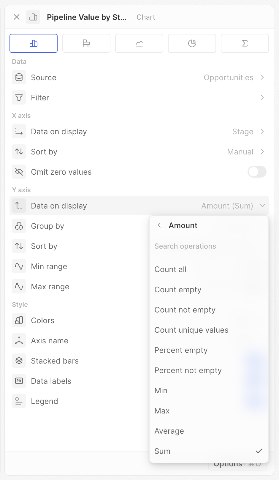
Le opzioni mostrate dipendono dal tipo di campo e di grafico. Se non vedi un’operazione prevista, verifica il tipo di campo.
Rapporto
Per i campi Selezione, Selezione multipla o Booleano, puoi calcolare la percentuale di un valore specifico.- Seleziona un campo di tipo Selezione, Selezione multipla o Booleano
- Abilita Rapporto
- Scegli l’opzione da misurare
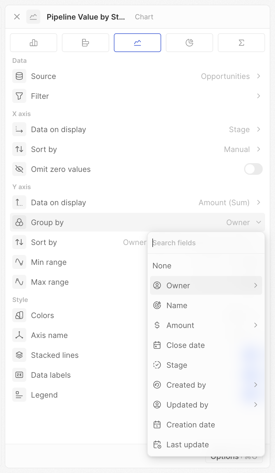
Raggruppa per
Aggiungi una seconda dimensione per creare più serie (più barre o linee).- Imposta prima il campo dell’asse X
- Fai clic su Raggruppa per
- Seleziona un secondo campo
Granularità della data
Quando Raggruppa per è un campo data, scegli il periodo temporale (stesse opzioni dell’asse X).Ordina per
Quando Raggruppa per è impostato, controlla l’ordine delle serie raggruppate (ad es., quale barra del proprietario appare per prima in ogni categoria). Stesse opzioni dell’ordinamento dell’asse X — Posizione, Alfabetico e Manuale — tranne che l’ordinamento basato sul valore non è disponibile per il raggruppamento secondario.Cumulativo
Mostra totali progressivi invece dei valori individuali.- Disattivo: ogni barra/punto mostra il proprio valore
- Attivo: ogni barra/punto mostra la somma di tutti i valori precedenti più il proprio
- Cumulativo disattivo: mostra 10 e 15
- Cumulativo attivo: mostra 10 e 25 (10 + 15)
Intervallo minimo / Intervallo massimo
Imposta valori minimi e massimi fissi per l’asse Y.- Lascia vuoto per la scalatura automatica
- Inserisci un numero per fissare il limite
- Imposta Min a 0 per confronti visivi accurati
- Imposta entrambi per scale coerenti su più grafici
- Concentrati su un intervallo di valori specifico impostando entrambi
Impostazioni stile
Colori
Imposta la combinazione di colori per il grafico. Scegli tra una varietà di palette di colori.Quando raggruppi per un campo Selezione, il grafico usa automaticamente i colori definiti per ogni opzione nelle impostazioni del campo.
Nome asse
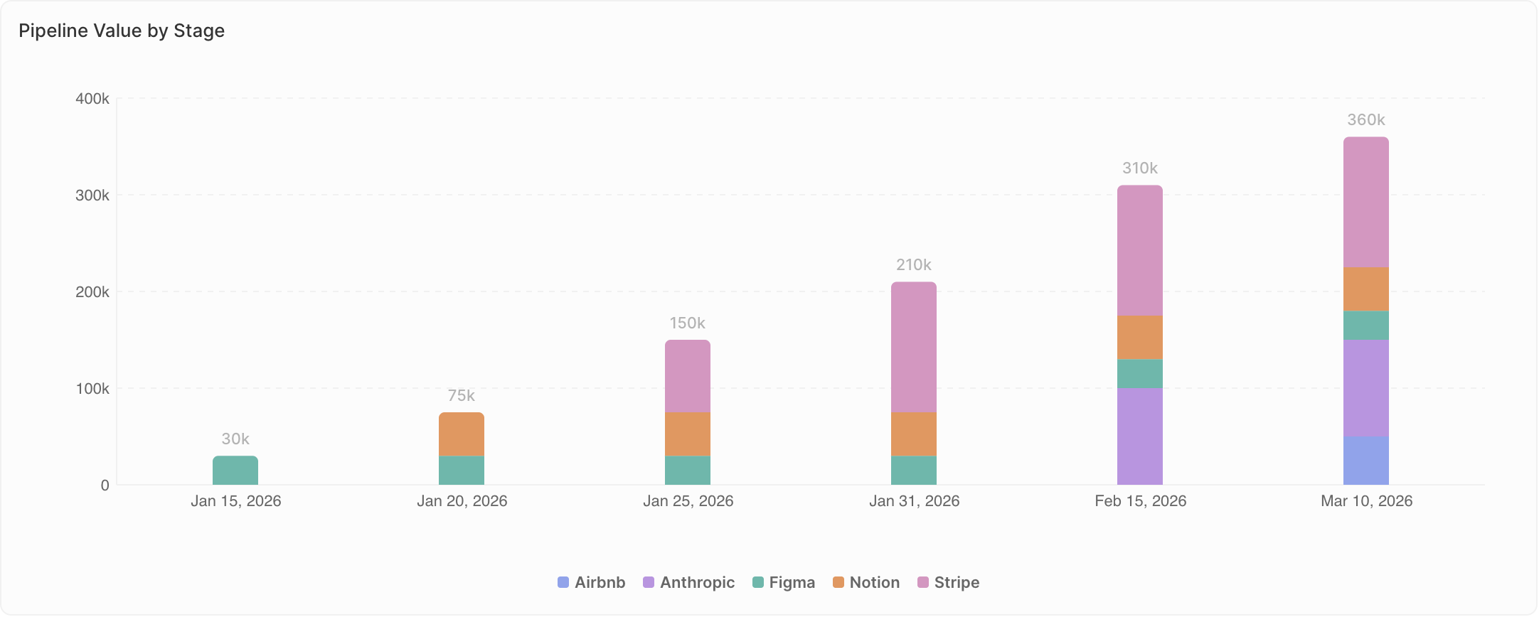
Scegli quali etichette degli assi mostrare: Nessuno, Asse X, Asse Y o Entrambi (solo grafici a barre e a linee).Barre impilate / Linee impilate
Quando Raggruppa per è impostato, scegli come visualizzare le serie multiple.- Disattivo (Raggruppate): le serie appaiono affiancate. Usa quando confronti valori esatti tra gruppi.
- Attivo (Impilate): le serie si impilano una sull’altra. Usa quando mostri la composizione, cioè come le parti costituiscono un insieme.
- Raggruppate: vedi i numeri esatti di ciascun proprietario affiancati
- Impilate: vedi il totale delle trattative per fase, con il contributo di ciascun proprietario impilato
Etichette dati
Mostra i valori direttamente sugli elementi del grafico (barre, punti, sezioni).- Attivo: i valori compaiono nel grafico
- Disattivo: nessun valore mostrato (aspetto più pulito)
Legenda
Mostra o nascondi la legenda (compare solo quando Raggruppa per è impostato).- Attivo: la legenda mostra cosa rappresenta ciascun colore
- Disattivo: nessuna legenda visualizzata
Note specifiche del grafico
Grafici a torta
- Ogni fetta rappresenta – Definisci come vengono raggruppate le fette
- Nascondi categoria vuota – Rimuovi le fette a valore zero
- Mostra il valore al centro – Visualizza il valore aggregato (somma, media, conteggio, ecc.)
Grafici aggregati
- Prefisso – Aggiungi testo prima del numero (ad es.,
$) - Suffisso – Aggiungi testo dopo il numero (ad es.,
%)