Widget disponibili
Twenty offre diversi tipi di widget per visualizzare i dati del tuo CRM.Grafici a barre
Mostra i dati come barre orizzontali o verticali.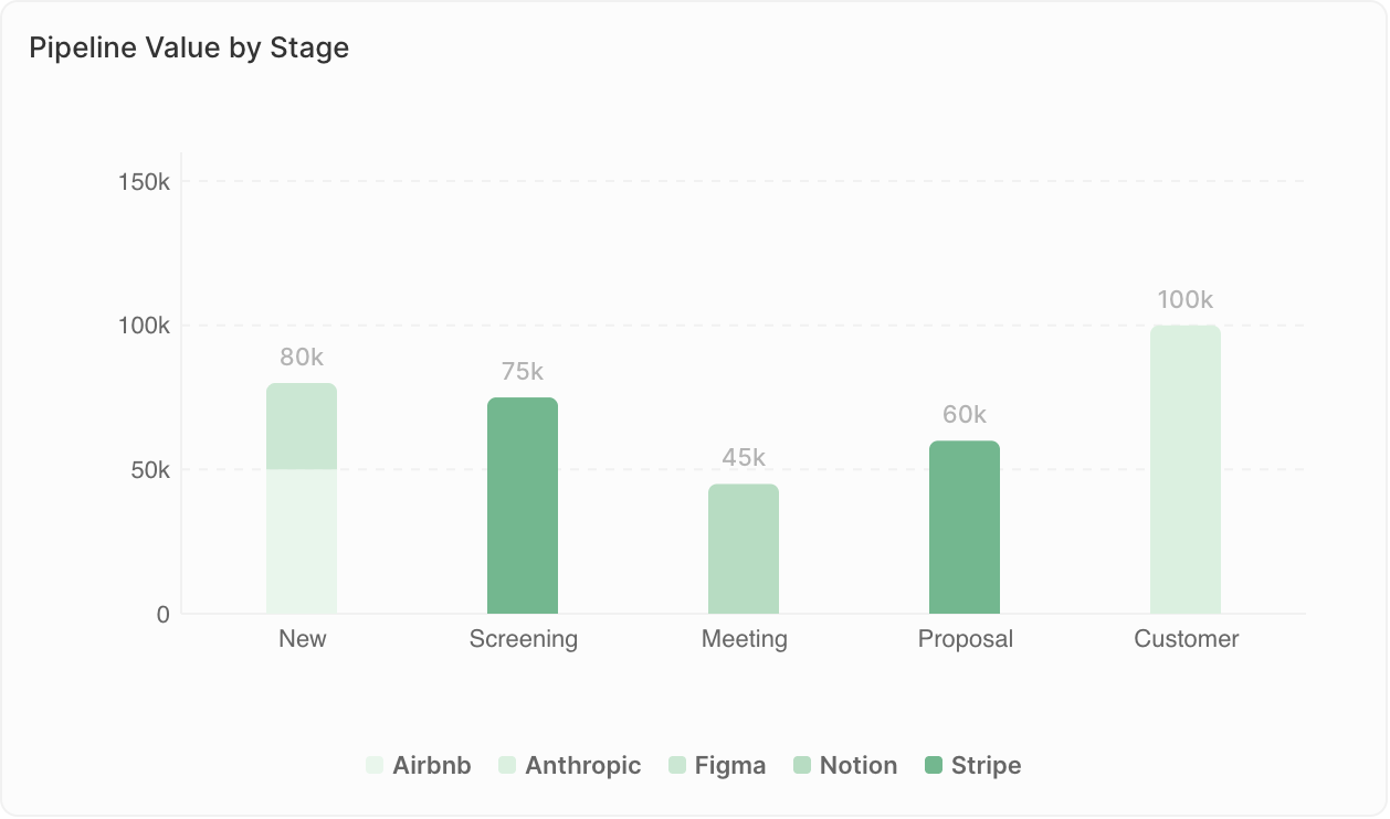
- Confrontare i valori tra categorie
- Mostrare classifiche
- Monitorare le metriche per periodo di tempo
- Opportunità per fase
- Ricavi per rappresentante commerciale
- Contatti aggiunti per mese
Limiti di visualizzazione: I grafici a barre possono mostrare al massimo 100 barre e, quando si usa Raggruppa per, 50 gruppi per barra. Se visualizzi l’avviso “Undisplayed data: max X bars per chart”, aggiungi filtri per restringere i dati o modifica il raggruppamento (ad es., raggruppa per settimana invece che per giorni).
Grafici a torta
Mostra le proporzioni del totale.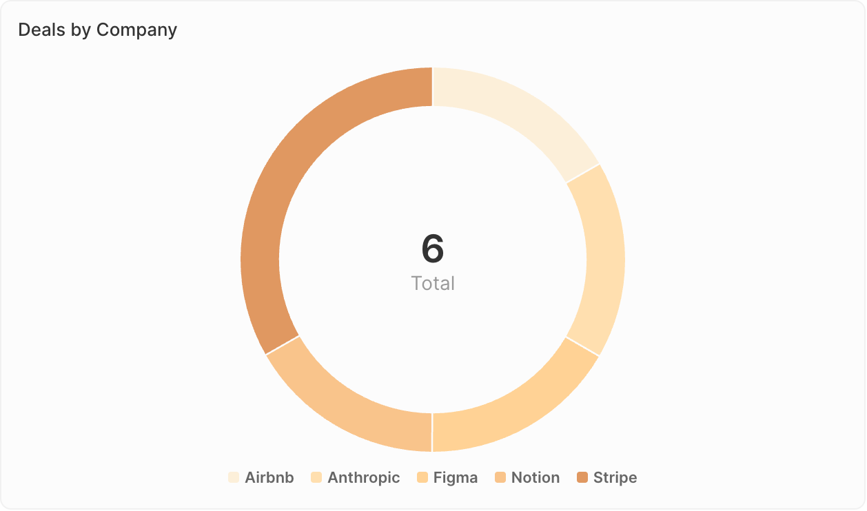
- Mostrare composizione o distribuzione
- Confrontare le parti con il totale
- Evidenziare i segmenti principali
- Distribuzione delle opportunità per fonte
- Ripartizione dei contatti per settore
- Composizione della pipeline per proprietario
Grafici a linee
Mostra le tendenze nel tempo.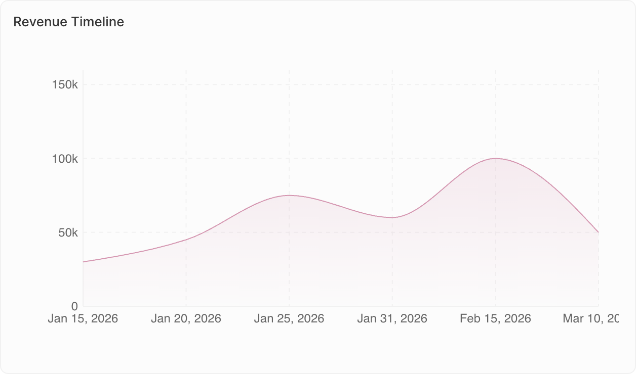
- Monitorare i cambiamenti nel tempo
- Individuare le tendenze
- Confrontare più metriche
- Andamento mensile del numero di opportunità
- Crescita dei ricavi per trimestre
- Livelli di attività nel tempo
Grafici aggregati
Mostra in evidenza singoli valori chiave.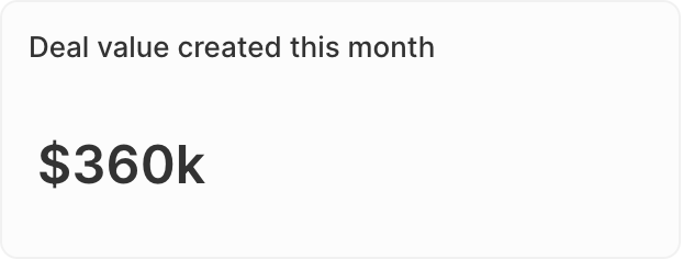
- Mettere in evidenza i KPI
- Mostrare totali o medie
- Controlli rapidi dello stato
- Valore totale della pipeline
- Numero di opportunità aperte
- Tasso di conversione
- Rapporto: Per i campi di tipo Select, calcola i rapporti tra i valori. Vai a Dati visualizzati → seleziona il tuo campo → abilita l’opzione Rapporto.
- Prefisso e suffisso: Aggiungi un testo personalizzato prima o dopo il numero (ad es., prefisso ”$” o suffisso ”%”) per una migliore leggibilità.
iFrames
Incorpora strumenti e contenuti esterni direttamente nella tua dashboard.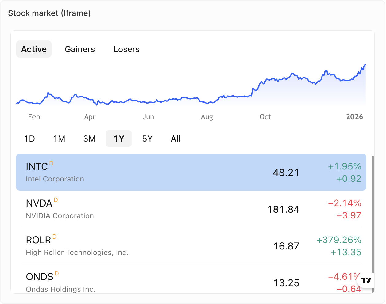
- Visualizzare report o dashboard esterni
- Integrare strumenti di vendita di terze parti
- Mostrare contenuti in tempo reale da altri sistemi
- Metriche dal tuo strumento di assistenza
- Metriche dal tuo dialer
- Contenuti in tempo reale dal tuo strumento per sequenze di vendita
Testo formattato
Aggiungi testo formattato e contenuti direttamente alla tua dashboard.
- Aggiunta di contesto o istruzioni
- Descrizioni della dashboard
- Note e annotazioni
- Formattazione del testo (grassetto, corsivo, elenchi, ecc.)
- Caricamento di immagini e file
- Modifica in stile Markdown
In arrivo: I grafici a indicatore e le tabelle non sono ancora disponibili ma sono nella nostra roadmap.
Duplicazione dei widget
- Fai clic sul widget
- Apri Opzioni
- Fai clic su Duplica widget